Multiple Choice
The following graph shows the average grade point average for a particular college from 2006 until 2013.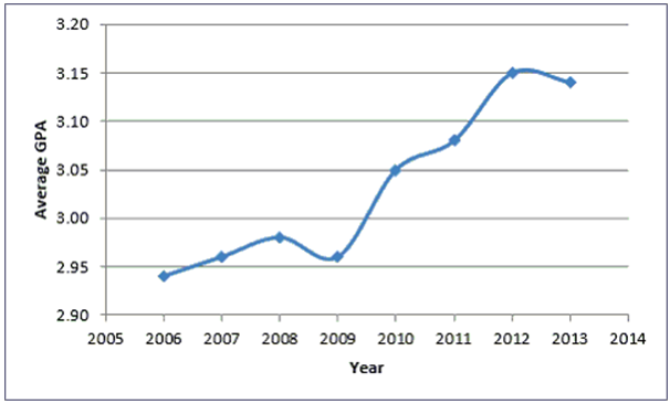
A) Average GPA is the dependent variable in the graph.
B) Historically, the Average GPA of the college tends to decrease.
C) There appears to be no relationship between Year and Average GPA.
D) Year is the dependent variable in the graph.
Correct Answer:

Verified
Correct Answer:
Verified
Q32: Continuous data are values based on observations
Q33: Use a------- chart if you want to
Q34: The following chart shows the average number
Q35: Each category of a pie chart occupies
Q36: ---------charts are a specific type of bar
Q38: Histograms displaying discrete data usually have gaps
Q39: A------- is a graph showing the number
Q40: The following chart shows the average number
Q41: A data set has 60 observations with
Q42: ----------classes are classes with boundaries that do