Multiple Choice
The following chart shows the average number of hours commuters spend in traffic delays per year at the six most congested cities in the U.S.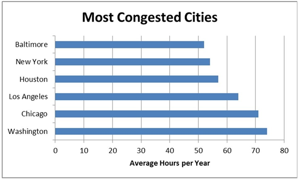
A) vertical bar chart.
B) horizontal bar chart.
C) Pareto chart.
D) stacked bar chart.
Correct Answer:

Verified
Correct Answer:
Verified
Related Questions
Q29: The stem and leaf display is a
Q30: A stem and leaf display allows you
Q31: The following graph shows the curb weight
Q32: Continuous data are values based on observations
Q33: Use a------- chart if you want to
Q35: Each category of a pie chart occupies
Q36: ---------charts are a specific type of bar
Q37: The following graph shows the average grade
Q38: Histograms displaying discrete data usually have gaps
Q39: A------- is a graph showing the number