Essay
The graph below shows the number of car accidents occurring in one city in each of the years 2011 through 2016. The number of accidents dropped in 2013 after a new speed limit
was imposed. Does the graph distort the data? How would you redesign the graph to be less
misleading? 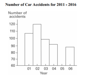
Correct Answer:

Verified
The graph distorts the data because the ...View Answer
Unlock this answer now
Get Access to more Verified Answers free of charge
Correct Answer:
Verified
View Answer
Unlock this answer now
Get Access to more Verified Answers free of charge
Q49: The frequency distribution below summarizes the
Q50: Explain in your own words why a
Q51: Kevin asked some of his friends
Q52: Smoking and the episodes of lung cancer
Q53: The following data represent the number
Q55: A store manager counts the number
Q56: The attendance counts for this season's
Q57: Describe how a data point labeled as
Q58: The two key parts of a regression
Q59: The frequency distribution below summarizes employee