Multiple Choice
Following is a pie chart that presents the percentages spent by a certain household on its five largest annual expenditures. What percentage of the money spent was spent on food, housing, and utilities?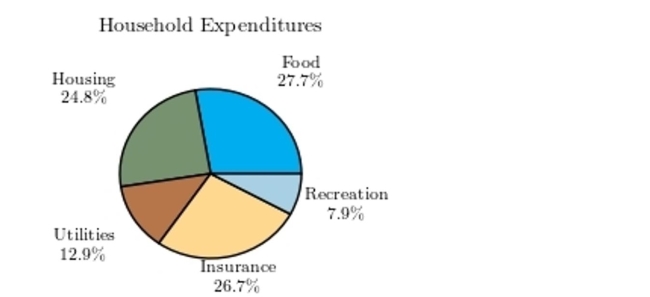
A) 47%
B) 52.5%
C) 65.4%
D) 60.4%
Correct Answer:

Verified
Correct Answer:
Verified
Related Questions
Q11: A sample of 200 high school students
Q12: The following bar graph presents the average
Q13: A sample of 200 high school students
Q14: The following table presents the purchase
Q15: Construct a dotplot for the following
Q17: The following frequency distribution presents the
Q18: The following pie chart presents the percentages
Q19: Classify the histogram as skewed to the
Q20: Thirty households were surveyed for the
Q21: Construct a dotplot for the following