Multiple Choice
Which choice displays the best graphic display of the amount of nitrous oxide (NO) 1) ____________ explained by the amount of carbon monoxide (CO) emissions in million metric tons over a
Ten year period in the United States? The data set is below:
A) Nitrous Oxide (NO) and Carbon Monoxide (CO)
Emissions in the U.S. over Ten Years
B) Nitrous Oxide (NO) and Carbon Monoxide (CO)
Emissions in the U.S. over Ten Years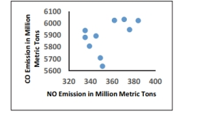
C) Nitrous Oxide (NO) and Carbon Monoxide (CO)
Emissions in the U.S. over Ten Years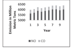
D) Nitrous Oxide (NO) and Carbon Monoxide (CO)
Emissions in the U.S. over Ten Years 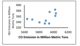
Correct Answer:

Verified
Correct Answer:
Verified
Q4: Describe the differences between a histogram and
Q13: Graphs should be constructed in a way
Q27: The following data set represents Heather's
Q28: The following frequency distribution represents the
Q29: The following data consists of the
Q35: A nurse measured the blood pressure of
Q36: The frequency distribution below summarizes employee
Q37: Define the difference between a Relative Frequency
Q37: A manufacturer records the number of
Q57: Describe how a data point labeled as