Multiple Choice
The scatterplot shows monthly sales figures (in units) and number of months of experience For a sample of salespeople. 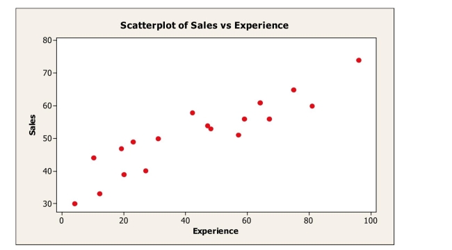
The correlation between monthly sales and level of experience is most likely
A) -.235.
B) 0.
C) .180.
D) -.914.
E) .914.
Correct Answer:

Verified
Correct Answer:
Verified
Q2: Shown below is a correlation table
Q3: A scatterplot of <span class="ql-formula"
Q4: A supermarket chain gathers data on the
Q5: For the following scatterplot, <br><br><img src="https://d2lvgg3v3hfg70.cloudfront.net/TB7191/.jpg" alt="For
Q6: After conducting a survey of his students,
Q7: A consumer research group examining the relationship
Q8: A study examined consumption levels of oil
Q9: The National Sleep Foundation reported a moderately
Q10: A company's sales increase by the same
Q11: A small independent organic food store offers