Multiple Choice
The graph below shows the approximate annual percentage growth rate in world population for the years 1960 through
2010. Data is estimated by the UN Census Bureau. 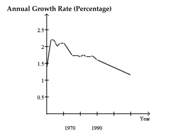 Use the graph to answer the question.
-Describe the trend in world population during the period 1990-2000
A) It decreases at a steady rate
B) It increases at a slower and slower rate
C) It decreases at a faster and faster rate
D) It increases at a steady rate
Correct Answer:

Verified
Correct Answer:
Verified
Q129: Use the guidelines to evaluate the study.
Q130: State whether you think that the variables
Q131: A sample statistic and margin of
Q132: A statement is made about correlation. State
Q133: Solve the problem.<br>-For the study described below,
Q135: Construct a pie chart representing the
Q136: State whether you think that the variables
Q137: Answer as requested.<br>-A researcher finds a positive
Q138: Answer the question.<br>-Which type of graphs can
Q139: Use the guidelines to evaluate the study.