Multiple Choice
Use the graph to answer the question. 
-Given the bar graph shown below, the Pareto chart that would best represent the data should have the bars in the following order. 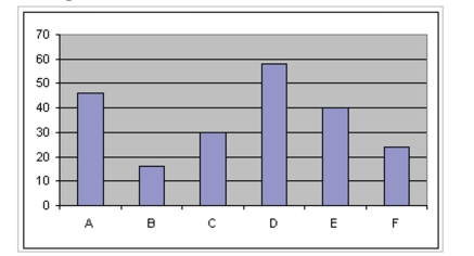
A) D A E C F B
B) B F C E A D
C) C A D E F B
D) B F E D AC
Correct Answer:

Verified
Correct Answer:
Verified
Related Questions
Q12: The pie chart shows the percentage
Q13: The pie chart shows the percentage
Q14: The pie chart shows the percentage of
Q15: The pie chart shows the percentage
Q16: Construct Histograms of Continuous Data<br>- <span
Q18: Create Cumulative Frequency and Relative Frequency
Q19: Create Cumulative Frequency and Relative Frequency
Q20: Draw Stem-and-Leaf Plots<br>-The heights (in inches)
Q21: The pie chart shows the percentage
Q22: Create Cumulative Frequency and Relative Frequency