Plot and Interpret the Appropriate Scatter Diagram Which Scatter Diagram Describes the Data and the Relationship, If
Multiple Choice
Plot and interpret the appropriate scatter diagram.
-The table gives the times spent watching TV and the grades of several students. Which scatter diagram describes the data and the relationship, if any?
A) 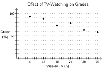
More hours spent watching TV may reduce grades.
B) 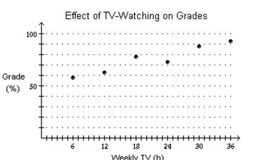
More hours spent watching TV may reduce grades.
C) 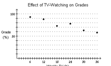
More hours spent watching TV may increase grades.
D) none of these
Correct Answer:

Verified
Correct Answer:
Verified
Q2: Solve the problem.<br>-Let f(x) be the function
Q3: Solve the problem.<br>-The one-day temperatures for
Q4: Graph the function f by starting with
Q5: Determine the average rate of change for
Q6: Find the vertex and axis of
Q7: Find the complex zeros of the
Q8: Determine the domain and the range
Q9: Use factoring to find the zeros
Q10: Use a graphing utility to find the
Q11: Find the complex zeros of the