Multiple Choice
The following bar graph presents the average amount a certain family spent, in dollars, on various food categories in a recent year.
On which food category was the most money spent? 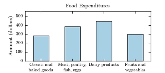
A) Meat poultry, fish, eggs
B) Fruits and vegetables
C) Dairy products
D) Cereals and baked goods
Correct Answer:

Verified
Correct Answer:
Verified
Related Questions
Q1: The following table presents the rate
Q2: The following frequency distribution presents the
Q3: A sample of 200 high school
Q4: A sample of 200 high school
Q5: Classify the histogram as skewed to the
Q7: The following frequency distribution presents the
Q8: Construct a dotplot for the following
Q9: The amounts 5 and 2 are compared.
Q10: Gravity on Mars: The gravity on Earth
Q11: The following time-series plot presents the population