Multiple Choice
The following table presents the rate of population growth of a suburb of Atlanta, Georgia for each of the years 1990 through 2009. Construct a time-series plot of the growth rate.
A) 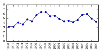
B) 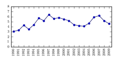
C) 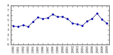
D) 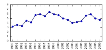
Correct Answer:

Verified
Correct Answer:
Verified
Related Questions
Q2: The following frequency distribution presents the
Q3: A sample of 200 high school
Q4: A sample of 200 high school
Q5: Classify the histogram as skewed to the
Q6: The following bar graph presents the average
Q7: The following frequency distribution presents the
Q8: Construct a dotplot for the following
Q9: The amounts 5 and 2 are compared.
Q10: Gravity on Mars: The gravity on Earth
Q11: The following time-series plot presents the population