Multiple Choice
The chart below can be best described as 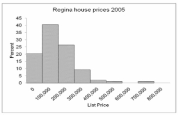
A) Frequency Polygon
B) Bar chart
C) Clustered bar chart
D) Stacked bar chart
E) Histogram
Correct Answer:

Verified
Correct Answer:
Verified
Related Questions
Q15: Which is the best (most informative and
Q16: The following represent the ages of students
Q17: What is the following table called? <img
Q18: A group of 100 students were surveyed
Q19: Consider the following stem and leaf plot:
Q21: (i. If you are constructing a stem-and-leaf
Q22: For the following distribution of heights, what
Q23: The chart below shows the Gross Domestic
Q24: What is the class midpoint of the
Q25: What is the class interval?<br>A) 9<br>B) 10<br>C)