Multiple Choice
The following graphic of cigarettes smoked (sold) per capita (CIG) and deaths per 100K population from lung cancer (LUNG) indicates _________ 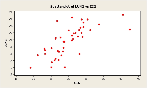
A) a weak negative relationship between the two variables
B) a somewhat positive relationship between the two variables
C) when the number of cigarettes smoked (sold) per capita (CIG) increases the deaths per 100K population from lung cancer (LUNG) decreases
D) a negative relationship between the two variables
E) no relationship between the two variables
Correct Answer:

Verified
Correct Answer:
Verified
Q14: The number of phone calls arriving
Q16: To show differences between different series during
Q25: A retail shoe company would like to
Q35: The following graphic of residential housing data
Q38: The following graphic of PCB Failures is
Q41: Suppose a market survey of 200 consumers
Q44: The following class intervals for a frequency
Q54: Time-series data should be shown from oldest
Q87: Consider the following frequency distribution:
Q96: Consider the relative frequency distribution given