Multiple Choice
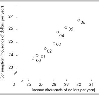
-In the above figure, the axis breaks are used
A) to create a misleading graph.
B) to indicate that there are jumps from the origin, 0, to the first values recorded along the axes.
C) to indicate that there are not enough data to be included in the graph.
D) to show that there are no data available for the omitted ranges.
Correct Answer:

Verified
Correct Answer:
Verified
Q84: <img src="https://d2lvgg3v3hfg70.cloudfront.net/TB8586/.jpg" alt=" -In the above
Q85: A positive relationship exists between two variables
Q86: A curve is plotted with y measured
Q87: Along a straight line, the value of
Q88: <img src="https://d2lvgg3v3hfg70.cloudfront.net/TB8586/.jpg" alt=" -The relationship between
Q90: What do economists mean when they discuss
Q91: Human resources that perform the functions of
Q92: <img src="https://d2lvgg3v3hfg70.cloudfront.net/TB8586/.jpg" alt=" -The slope of
Q93: Suppose you are working four nights per
Q94: A diagram shows the quantity of tomatoes