Multiple Choice
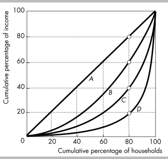
-In the figure above, the Lorenz curve that shows the richest 20 percent of households receiving 80 percent of all income is
A) curve A.
B) curve B.
C) curve C.
D) curve D.
Correct Answer:

Verified
Correct Answer:
Verified
Related Questions
Q31: The mean (average) U.S. family income in
Q32: The table shows the distributions of market
Q33: With a proportional tax<br>A) a poor household
Q34: Income is distributed _ equally than wealth
Q35: In the United States, the percentage of
Q37: What is the difference between market income
Q38: When China embarked on market changes towards
Q39: <img src="https://d2lvgg3v3hfg70.cloudfront.net/TB8586/.jpg" alt=" -The above figure
Q40: The data show that an individual's wealth
Q41: In the country of Wilkes, taxes are