Multiple Choice
Use the figure to answer the following question. 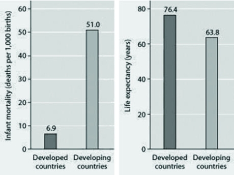 Infant mortality and life expectancy at birth in developed and
Developing countries (data as of 2005) .
What is a logical conclusion that can be drawn from the graphs about developed countries?
A) lower infant mortality rates and lower life expectancy than developing countries
B) higher infant mortality rates and lower life expectancy than developing countries
C) lower infant mortality rates and higher life expectancy than developing countries
D) higher infant mortality rates and higher life expectancy than developing countries
Correct Answer:

Verified
Correct Answer:
Verified
Q58: Which of the following is a critical
Q59: Use the graph to answer the following
Q60: Use the figure to answer the following
Q61: A species population's size (N) may vary
Q62: To measure the population of lake trout
Q64: Which of the following is accurate about
Q65: Which of the following techniques would most
Q66: Use the graph to answer the following
Q67: Two breeding female fish of the same
Q68: In which of the following situations would