Multiple Choice
Figure 7-8 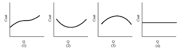
Of the graphs in Figure 7-8, which diagram is most likely to be the marginal cost?
A) 1
B) 2
C) 3
D) 4
Correct Answer:

Verified
Correct Answer:
Verified
Q27: Cost curves in the long run differ
Q101: Figure 7-1 <img src="https://d2lvgg3v3hfg70.cloudfront.net/TB8592/.jpg" alt="Figure 7-1
Q125: For most firms, the short run is
Q129: Table 7-4 <img src="https://d2lvgg3v3hfg70.cloudfront.net/TBX9061/.jpg" alt="Table 7-4
Q130: Figure 7-14 <br><img src="https://d2lvgg3v3hfg70.cloudfront.net/TBX9061/.jpg" alt="Figure 7-14
Q132: Figure 7-15 <br><img src="https://d2lvgg3v3hfg70.cloudfront.net/TBX9061/.jpg" alt="Figure 7-15
Q138: Figure 7-1 <br><img src="https://d2lvgg3v3hfg70.cloudfront.net/TBX9061/.jpg" alt="Figure 7-1
Q202: The long-run average cost curve<br>A)is a composite
Q206: If a firm has increasing returns to
Q212: A production indifference curve shows all combinations