Multiple Choice
Figure 7-8 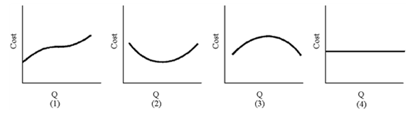
Of the graphs in Figure 7-8, which represents total cost?
A) 1
B) 2
C) 3
D) 4
Correct Answer:

Verified
Correct Answer:
Verified
Related Questions
Q27: Cost curves in the long run differ
Q47: At a given level of wheat output,
Q98: A firm produces 2,000 high-quality bicycles per
Q121: The table below gives data on output
Q122: Give a short concise definition for the
Q123: Figure 7-11 <br><img src="https://d2lvgg3v3hfg70.cloudfront.net/TBX9061/.jpg" alt="Figure 7-11
Q127: John Amaker owns orange groves and hires
Q129: Table 7-4 <img src="https://d2lvgg3v3hfg70.cloudfront.net/TBX9061/.jpg" alt="Table 7-4
Q130: Figure 7-14 <br><img src="https://d2lvgg3v3hfg70.cloudfront.net/TBX9061/.jpg" alt="Figure 7-14
Q207: The short-run average cost curve shows the