Multiple Choice
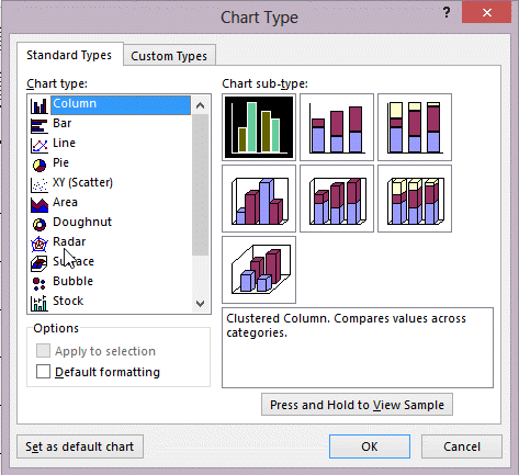 In the figure above, which chart would you most likely use to show comparisons of values, such as annual sales for a different product for several sales representatives?
A) Column
B) Pie
C) Doughnut
D) Scatter
Correct Answer:

Verified
Correct Answer:
Verified
Q21: Which chart type would use horizontal bars
Q32: Access provides a(n) _ Wizard that steps
Q34: Ben works at the local animal shelter.
Q43: What is the third optional argument for
Q48: <img src="https://d2lvgg3v3hfg70.cloudfront.net/TBX8825/.jpg" alt=" In the figure
Q50: <img src="https://d2lvgg3v3hfg70.cloudfront.net/TBX8825/.jpg" alt=" In the figure
Q54: <img src="https://d2lvgg3v3hfg70.cloudfront.net/TBX8825/.jpg" alt=" The chart in
Q55: The _ layout positions labels across the
Q57: <img src="https://d2lvgg3v3hfg70.cloudfront.net/TBX8825/.jpg" alt=" In the figure
Q68: In a report, the Narrow margin option