Multiple Choice
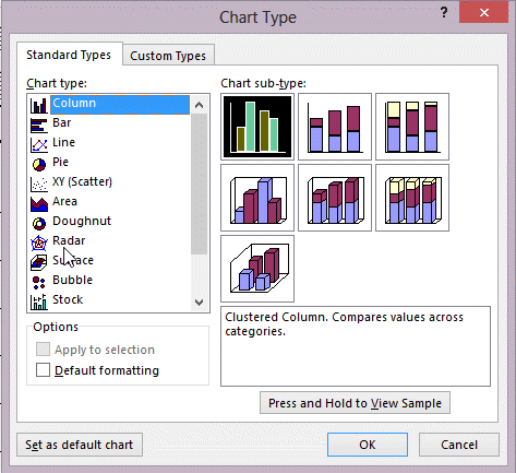 In the figure above, which chart would you most likely use to show trends over time?
A) Surface
B) Pie
C) Radar
D) Line
Correct Answer:

Verified
Correct Answer:
Verified
Related Questions
Q6: To change the color of the bars
Q18: Charts can be added to forms or
Q34: Ben works at the local animal shelter.
Q43: <img src="https://d2lvgg3v3hfg70.cloudfront.net/TBX8825/.jpg" alt=" The chart in
Q43: What is the third optional argument for
Q44: <img src="https://d2lvgg3v3hfg70.cloudfront.net/TBX8825/.jpg" alt=" The chart in
Q50: <img src="https://d2lvgg3v3hfg70.cloudfront.net/TBX8825/.jpg" alt=" In the figure
Q52: <img src="https://d2lvgg3v3hfg70.cloudfront.net/TBX8825/.jpg" alt=" In the figure
Q55: The _ layout positions labels across the
Q68: In a report, the Narrow margin option