Not Answered
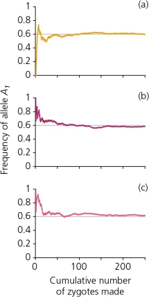
A scenario in which 250 zygotes are formed from a gene pool in which the frequency of the allele A₁ is 0.6,and A₂ is 0.4,generates the accompanying figure.Explain,in general terms,what each of these graphs reveals.Is there a consistent pattern between all three graphs? If so,describe and provide an explanation for it.Are there inconsistencies among graphs? Describe and provide an explanation for these also.
Correct Answer:

Verified
Correct Answer:
Verified
Q7: A phenomenon known as _ [one or
Q8: Gene flow through migration _.<br>A) has no
Q9: The accompanying figure details the possible outcomes
Q10: Data in the accompanying figure shows the
Q11: A locus at which different individuals in
Q13: The effects of inbreeding depression has been
Q14: In an evolutionary sense,_ is the transfer
Q15: With enough time and in the absence
Q16: The random discrepancy between theoretical predictions and
Q17: The survival and fertility rates of the