Multiple Choice
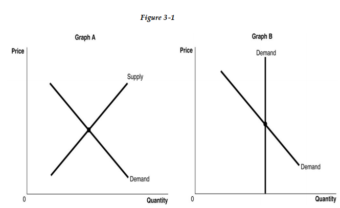
-Refer to Figure 3 -1. The figure above shows the supply and demand curves for two markets: the market for original Picasso paintings, and the market for designer jeans. Which graph most likely represents which market?
A) Graph B represents the market for original Picasso paintings and Graph A represents the market for designer jeans.
B) Graph B represents both the market for original Picasso paintings and designer jeans.
C) Graph A represents the market for original Picasso paintings and Graph B represents the market for designer jeans.
D) Graph A represents both the market for original Picasso paintings and designer jeans.
Correct Answer:

Verified
Correct Answer:
Verified
Q7: In Saudi Arabia, the price of chicken
Q8: Consider the collectors' market for first editions
Q9: <img src="https://d2lvgg3v3hfg70.cloudfront.net/TB9865/.jpg" alt=" -Refer to Figure
Q10: Research suggests that supermarkets should consider which
Q11: New technology developed in 1999 resulted in
Q13: According to the Australian Wool Innovation, severe
Q14: <img src="https://d2lvgg3v3hfg70.cloudfront.net/TB9865/.jpg" alt=" -Refer to Figure
Q15: <img src="https://d2lvgg3v3hfg70.cloudfront.net/TB9865/.jpg" alt=" -Refer to Figure
Q16: Fluctuations in the prices of oil are
Q17: Mazin subscribes to a monthly pest control