The Following Figure Gives the Graph Of , Where Is the Computer Hard Disk Capacity (In Hundreds of Megabytes)
Short Answer
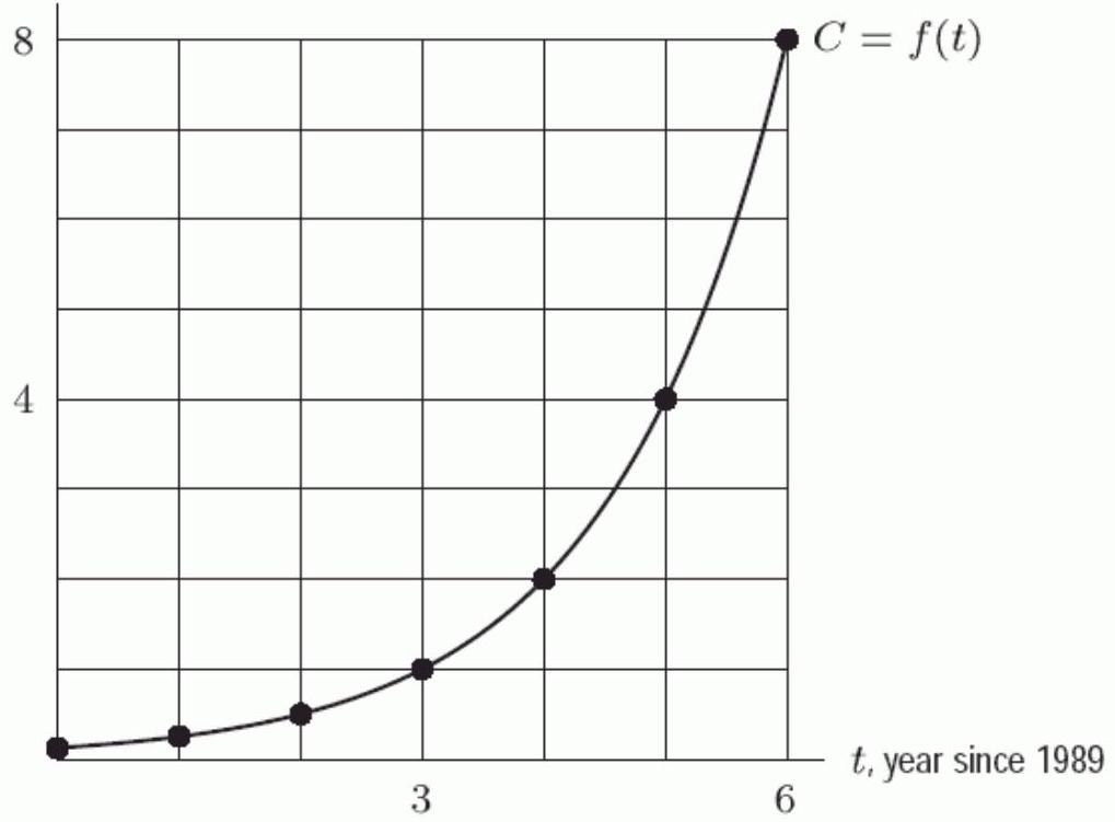
The following figure gives the graph of , where is the computer hard disk capacity (in hundreds of megabytes) that could be bought for years past 1989 . If the trend displayed in the graph continued, in what year would the capacity that can be bought for be 4,600 ?
Correct Answer:

Verified
Correct Answer:
Verified
Q69: Jeff has <span class="ql-formula" data-value="\$
Q70: Which of the graphs in the
Q71: The amount of pollution in a
Q72: A biologist measures the amount of
Q73: Is the function graphed exponential?<br> <img src="https://d2lvgg3v3hfg70.cloudfront.net/TBW1046/.jpg"
Q75: Each of the functions in the
Q76: The US population in 2005 was
Q77: A biologist measures the amount of
Q78: What is <span class="ql-formula" data-value="\lim
Q79: An ant population grows at a