Multiple Choice
Table 2.2 Number of Prior Convictions among Inmates at a Prison
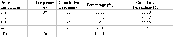
-What would be an ideal graph to represent the data shown in Table 2.2?
A) frequency polygon
B) pie chart
C) bar chart
D) rate graph
Correct Answer:

Verified
Correct Answer:
Verified
Related Questions
Q1: Which of the following should be reflected
Q2: Table 2.1 Age of Respondents<br> <img src="https://d2lvgg3v3hfg70.cloudfront.net/TB10833/.jpg"
Q3: Table 2.2 Number of Prior Convictions among
Q5: A company has 8 entry-level workers and
Q6: The variable "number of fitness centres" across
Q7: A researcher presents a figure to depict
Q8: Table 2.2 Number of Prior Convictions among
Q9: Table 2.2 Number of Prior Convictions among
Q10: In June 2014, the entire province of
Q11: Why do researchers commonly use intervals when