Multiple Choice
Figure 52.9 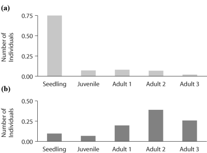
-Figure 52.9 shows the age structure of Common Primrose populations as they change over time.One of the populations is growing under high light conditions and the other under low light.Based on the graphs in Figure 52.9,which graph,(a) or (b) ,represents a population growing in high light availability?
A) (a)
B) (b)
C) cannot tell with this information
Correct Answer:

Verified
Correct Answer:
Verified
Q5: It is estimated that a flock of
Q33: If 60 snow geese were alive in
Q35: Figure 52.6 <img src="https://d2lvgg3v3hfg70.cloudfront.net/TB3734/.jpg" alt="Figure 52.6
Q37: Figure 52.7 <img src="https://d2lvgg3v3hfg70.cloudfront.net/TB3734/.jpg" alt="Figure 52.7
Q38: A model that estimates the likelihood that
Q39: Suppose researchers marked 800 turtles and later
Q41: Figure 52.4 <img src="https://d2lvgg3v3hfg70.cloudfront.net/TB3734/.jpg" alt="Figure 52.4
Q42: You observe two female fish of the
Q43: Figure 52.14 <img src="https://d2lvgg3v3hfg70.cloudfront.net/TB3734/.jpg" alt="Figure 52.14
Q45: Figure 52.1 <img src="https://d2lvgg3v3hfg70.cloudfront.net/TB3734/.jpg" alt="Figure 52.1