Multiple Choice
Use the table below to answer the following question.
Table 1A.4.3
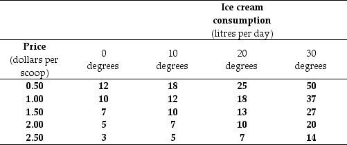
-Refer to Table 1A.4.3. The table shows some data on the quantity of ice cream consumed at different prices and in different weather conditions. To draw a graph of the relationship between the quantity of the ice cream consumed and the price of ice cream, we must
A) decrease the temperature as the price rises.
B) pick the temperature that prevailed when the price was $1.00.
C) increase the temperature as the price rises.
D) hold the temperature constant at any of the four levels shown.
E) hold the price constant at any of the five levels shown.
Correct Answer:

Verified
Correct Answer:
Verified
Q25: The fact that a hockey star earns
Q31: What choices are best for the entire
Q33: The equation of a line is y
Q64: Use the figure below to answer the
Q66: Use the figure below to answer the
Q68: When a textile firm decides to produce
Q94: Use the figure below to answer the
Q101: Use the figure below to answer the
Q133: Use the figure below to answer the
Q147: Which one of the following would economists