Multiple Choice
Figure 3.3 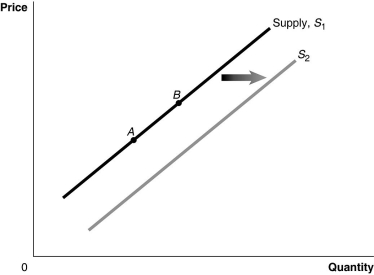 Alt text for Figure 3.3: In figure 3.3, a graph of the effect of an increase in the price of inputs on the supply curve.
Long description for Figure 3.3: The x-axis is labelled, Quantity, and the y-axis is labelled, Price.Curve Supply, S1, is a straight line which slopes up from the bottom left corner to the top right corner.2 points, A and B, are marked in the middle of curve S1.Curve S2 follows the same slope as curve S1, but is plotted to the right.A right pointing arrow indicates the change from curve S1 to curve S2.
-Refer to Figure 3.3.An increase in price of inputs would be represented by a movement from
A) A to B.
B) B to A.
C) S1 to S2.
D) S2 to S1.
Correct Answer:

Verified
Correct Answer:
Verified
Q9: Table 3-3<br> <img src="https://d2lvgg3v3hfg70.cloudfront.net/TB4190/.jpg" alt="Table 3-3
Q20: If the demand for a product decreases
Q32: How has the growing popularity of on-line
Q33: Which of the following would cause an
Q37: Table 3.1 <img src="https://d2lvgg3v3hfg70.cloudfront.net/TB3061/.jpg" alt="Table 3.1
Q38: In response to a shortage, the market
Q39: In each of the following situations, list
Q40: Figure 3.14 <img src="https://d2lvgg3v3hfg70.cloudfront.net/TB3061/.jpg" alt="Figure 3.14
Q119: George Gnat subscribes to a monthly pest
Q150: In October, market analysts predict that the