Multiple Choice
Figure 3.6 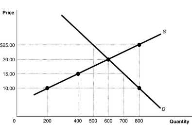 Alt text for Figure 3.6: In figure 3.6, a graph of intersecting supply and demand curves illustrates shortage and surplus in a market, along with its equilibrium.
Long description for Figure 3.6: The x-axis is labelled, Quantity, with the values 0, 200, 400, 500, 600, 700 and 800 marked.The y-axis is labelled, Price, with the values 0, 10.00, 15.00, 20.00 and 25.00 dollars marked.Curve Supply S is a straight line which slopes up from the bottom left corner to the top right corner.4 points are plotted along the curve; (200, 10) , (400, 15) , (600, 20) , and (800, 25) .Demand curve D is a straight line which slopes down from the top left corner to the bottom right corner.Curve D intersects the S curve at (600, 20) , and passes through another point, (800, 10) .All plotted points are connected to the corresponding values on the x and y-axis with dotted lines.
-Refer to Figure 3.6.At a price of $10, how many units will be sold?
A) 200
B) 400
C) 600
D) 800
Correct Answer:

Verified
Correct Answer:
Verified
Q37: Which of the following will not shift
Q61: In July,market analysts predict that the price
Q88: State whether each of the following pairs
Q90: Figure 3.6 <img src="https://d2lvgg3v3hfg70.cloudfront.net/TB3061/.jpg" alt="Figure 3.6
Q92: Tuition rises almost every year, yet universities
Q94: Figure 3.7 <img src="https://d2lvgg3v3hfg70.cloudfront.net/TB3061/.jpg" alt="Figure 3.7
Q95: What would happen in the market for
Q98: If the price of propane-fuelled gas BBQs
Q143: A decrease in the price of inputs
Q216: Chips and salsa are complements.If the price