Essay
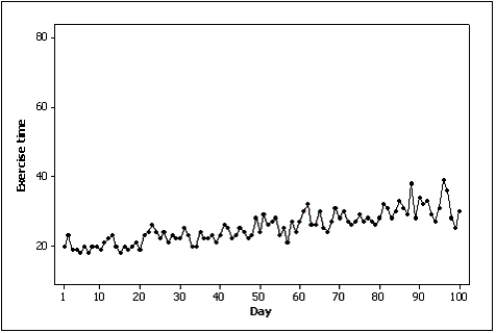
Samantha recorded her amount of exercise time (in minutes)for 100 days.Both of the line charts below were created based on her same data set.Which line chart makes her exercise times look more variable and why? 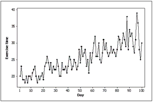
Correct Answer:

Verified
The first line chart looks mor...View Answer
Unlock this answer now
Get Access to more Verified Answers free of charge
Correct Answer:
Verified
View Answer
Unlock this answer now
Get Access to more Verified Answers free of charge
Q111: Time-series data are often graphically depicted how?<br>A)Bar
Q112: Which of the following statements illustrates graphical
Q113: A histogram is said to be _
Q114: {Teachers Ages Narrative} Draw a frequency histogram
Q115: A professor examines the relationship between minutes
Q117: The sum of the relative frequencies for
Q118: The effect of making the slope of
Q119: Pie charts only show _,not _.This means
Q120: Which of the following represents a graphical
Q121: When a distribution has more values to