Multiple Choice
Figure 35-1.The left-hand graph shows a short-run aggregate-supply (SRAS) curve and two aggregate-demand (AD) curves.On the right-hand diagram,U represents the unemployment rate. 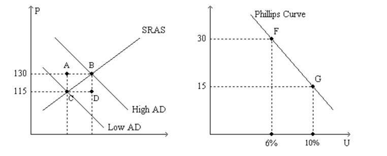
-Refer to Figure 35-1.Assuming the price level in the previous year was 100,point G on the right-hand graph corresponds to
A) point A on the left-hand graph.
B) point B on the left-hand graph.
C) point C on the left-hand graph.
D) point D on the left-hand graph.
Correct Answer:

Verified
Correct Answer:
Verified
Q70: If policymakers increase aggregate demand,then in the
Q71: If policymakers expand aggregate demand,then in the
Q72: Figure 35-2<br>Use the pair of diagrams below
Q75: In 2007 and 2008 households and firms
Q76: There is a<br>A)short-run tradeoff between inflation and
Q79: A.W.Phillips found a<br>A)positive relation between unemployment and
Q106: If the central bank increases the money
Q110: Suppose Congress decides to reduce government expenditures
Q162: Which of the following would we not
Q211: Figure 35-1 <img src="https://d2lvgg3v3hfg70.cloudfront.net/TB7555/.jpg" alt="Figure 35-1