Multiple Choice
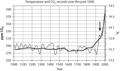 The graph shows records of temperature (light gray line) and CO2 (dark gray line) over the past 1,000 years. CO2 is recorded in parts per million (ppm) .
-If you focus on the data from the mid-1900s (indicated by the arrow) through today, the graph shows that
A) there is a correlation between CO2 and temperature; when CO2 levels are high, so is temperature.
B) there is a correlation between CO2 and temperature; when CO2 levels are high, temperature is low.
C) there is no correlation between CO2 and temperature; CO2 fluctuates randomly and temperature is constant.
D) there is no correlation between CO2 and temperature; CO2 is constant and temperature fluctuates randomly.
Correct Answer:

Verified
Correct Answer:
Verified
Q5: What is the source of energy that
Q6: Plant cells<br>A) lack mitochondria and chloroplasts.<br>B) lack
Q7: Purple sulfur bacteria are organisms capable of
Q8: Thylakoids are arranged in stacks called<br>A) cristae.<br>B)
Q9: In photophosphorylation, energy from electron flow is
Q11: Sunlight is a type of _ energy.<br>A)
Q12: Plant cells are protected from the harmful
Q13: Global warming due to the greenhouse effect
Q14: What is the likely origin of chloroplasts?<br>A)
Q15: CO<sub>2 </sub>enters and O<sub>2</sub> escapes from a