Multiple Choice
Each of the panels given below represents the short-run equilibrium in the U.S.economy.The Aggregate Demand and Aggregate Supply curves in each panel responds to various economic changes. Figure 8.1 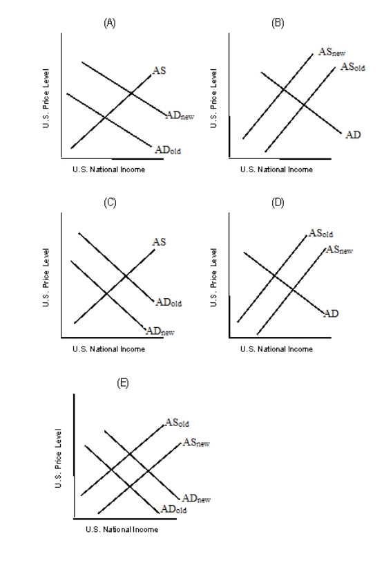 Refer to Figure 8.1.Which of the graphs in the figure best describes the impact of an effective oil embargo that raises the price of gasoline?
A) Panel A
B) Panel B
C) Panel C
D) Panel D
E) Panel E
Correct Answer:

Verified
Correct Answer:
Verified
Q20: The figure given below represents the equilibrium
Q21: The fact that the aggregate demand curve
Q22: Identify the correct statement about the aggregate
Q23: The table given below reports the average
Q24: Other things held constant, when the general
Q26: The AD curve will shift to the
Q27: The steeper slope of the aggregate supply
Q28: Which of the following is an impact
Q29: Given that energy is an input in
Q30: A higher domestic price level lowers aggregate