Multiple Choice
Figure 8-20
On the vertical axis of each graph, DWL is deadweight loss.
-Refer to Figure 8-20. Which graph correctly illustrates the relationship between the size of a tax and the size of the deadweight loss associated with the tax? 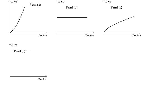
A) Panel (a)
B) Panel (b)
C) Panel (c)
D) Panel (d)
Correct Answer:

Verified
Correct Answer:
Verified
Q9: Suppose that the market for product X
Q25: Consider a good to which a per-unit
Q36: A tax levied on the buyers of
Q41: For a good that is taxed,the area
Q45: Figure 8-25 <img src="https://d2lvgg3v3hfg70.cloudfront.net/TB2297/.jpg" alt="Figure 8-25
Q57: If the tax on gasoline increases from
Q59: Suppose a tax of $0.10 per unit
Q129: Figure 8-2<br>The vertical distance between points A
Q145: The elasticities of the supply and demand
Q235: Figure 8-2<br>The vertical distance between points A