Exam 3: Data Visualization
Exam 1: Introduction to Labour Market Economics62 Questions
Exam 2: Database Analytics30 Questions
Exam 3: Data Visualization30 Questions
Exam 4: Descriptive Statistics109 Questions
Exam 5: Probability Distributions and Data Modeling33 Questions
Exam 6: Sampling and Estimation55 Questions
Exam 7: Statistical Inference46 Questions
Exam 8: Trendlines and Regression Analysis58 Questions
Exam 9: Forecasting Techniques47 Questions
Exam 10: Introduction to Data Mining43 Questions
Exam 11: Spreadsheet Modeling and Analysis60 Questions
Exam 12: Simulation and Risk Analysis29 Questions
Exam 13: Linear Optimization62 Questions
Exam 14: Integer and Nonlinear Optimization Models93 Questions
Exam 15: Optimization Analytics48 Questions
Exam 16: Decision Analysis49 Questions
Select questions type
Describe how to and construct an area chart exhibiting the units ordered by the region of Puitoria over the three months.
Free
(Essay)
4.7/5  (26)
(26)
Correct Answer: Verified
Filter the data set by Region Puitoria). Sort the Order Date by Oldest to Newest. Select the columns A and F of the data set and choose the type of chart Area Chart) from the Charts group under the Insert tab. Change the title and make data and formatting changes where necessary. 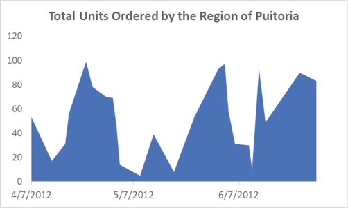
Use the data given below to answer the following questions).
Following is the purchase order database of 'The Chef Says So', a restaurant in New York, over the last quarter April-June). A B C D E F 1 Order Date Item Region Supplier Unit Cost Units 2 5/6/2012 Steel Fork Antasia Peter 5.44 98 3 4/7/2012 Ceramic Plate Puitoria Kane 23.44 53 4 5/13/2012 Steel Fork Puitoria Jones 8.44 39 5 6/10/2012 Silver Spoon Puitoria Gerry 23.44 30 6 6/22/2012 Steel Fork Almeco Sarah 6.44 59 7 5/17/2012 Ceramic Plate Antasia Peter 8.44 63 8 4/25/2012 Steel Fork Puitoria Audrey 5.44 78 9 6/1/2012 Steel Fork Puitoria Jones 8.44 93 10 4/2/2012 Steel Fork Almeco Thomas 5.44 35 11 5/27/2012 Ceramic Plate Antasia Peter 12.44 63 12 6/13/2012 Steel Fork Puitoria Mary 8.44 93 13 4/30/2012 Ceramic Plate Antasia Henry 5.44 32 14 5/11/2012 Ceramic Plate Antasia Philip 23.44 84 15 6/18/2012 Steel Fork Antasia Peter 8.44 38 16 5/9/2012 Glass Bottle Putoria Simson 128.45 5 17 5/30/2012 Ceramic Bowl Antasia Peter 19.44 19 18 6/6/2012 Ceramic Plate Puitoria Mary 12.44 31 19 4/3/2012 Silver Spoon Antasia Peter 12.44 67 20 6/26/2012 Silver Spoon Antasia Philip 23.44 18 21 4/23/2012 Ceramic Bowl Puitoria Kane 8.44 99 22 4/29/2012 Steel Fork Puitoria Simson 4.74 70 23 4/4/2012 Ceramic Bowl Antasia Philip 19.44 77 24 6/15/2012 Ceramic Plate Puitoria Gerry 12.44 49
-Changes to the type of chart, data included in the chart, and chart layout and styles can be made from the Layout tab.
Free
(True/False)
4.8/5 (37)
Correct Answer:Verified
False
You may not display data bars without the data in the cells.
Free
(True/False)
4.9/5 (38)
Correct Answer:Verified
False
To select a chart type in Excel from the Charts group, which tab has to be accessed?
(Multiple Choice)
4.8/5 (31)
Describe how to and construct a column chart exhibiting the total units purchased by region.
(Essay)
4.8/5 (37)
Which of the following charts allows plotting of multiple dimensions of several data series?
(Multiple Choice)
4.8/5 (39)
Icon Sets can provide more information than Color Scales because they allow you to combine shapes and arrows.
(True/False)
4.9/5 (35)
Describe how to and construct a pie chart exhibiting the count of purchase orders by item.
(Essay)
4.8/5 (41)
Describe how to and construct a combination chart exhibiting the purchase order of ceramic plates as a line, and the unit cost as columns on the secondary axis over the three months.
(Essay)
4.9/5 (45)
Elaborate on the use of geographic data mapping in business analytics.
(Essay)
4.9/5 (37)
Which of the following charts shows three-dimensional data?
(Multiple Choice)
4.8/5 (42)
Describe how to and construct a scatter chart exhibiting the relationship between the unit cost and the number of units for the purchase of steel forks.
(Essay)
4.9/5 (37)
Peige, a stock broker, has data consisting of price, price/earnings ratio, and market capitalization for seven different stocks on one particular day. She wishes to plot these three variables in two dimensions. Which of the following charts must Peige use?
(Multiple Choice)
4.9/5 (34)
Let's suppose you have a data set reporting the sales of five different product categories across the columns, and for each of the past four quarters, listed across the rows. Which of the following use of Sparklines would be the most appropriate?
(Multiple Choice)
4.8/5 (37)
After choosing the PivotTable, the PivotChart can be found on the tab.
(Multiple Choice)
4.8/5 (35)
Use the data given below to answer the following questions).
Following is the purchase order database of 'The Chef Says So', a restaurant in New York, over the last quarter April-June). A B C D E F 1 Order Date Item Region Supplier Unit Cost Units 2 5/6/2012 Steel Fork Antasia Peter 5.44 98 3 4/7/2012 Ceramic Plate Puitoria Kane 23.44 53 4 5/13/2012 Steel Fork Puitoria Jones 8.44 39 5 6/10/2012 Silver Spoon Puitoria Gerry 23.44 30 6 6/22/2012 Steel Fork Almeco Sarah 6.44 59 7 5/17/2012 Ceramic Plate Antasia Peter 8.44 63 8 4/25/2012 Steel Fork Puitoria Audrey 5.44 78 9 6/1/2012 Steel Fork Puitoria Jones 8.44 93 10 4/2/2012 Steel Fork Almeco Thomas 5.44 35 11 5/27/2012 Ceramic Plate Antasia Peter 12.44 63 12 6/13/2012 Steel Fork Puitoria Mary 8.44 93 13 4/30/2012 Ceramic Plate Antasia Henry 5.44 32 14 5/11/2012 Ceramic Plate Antasia Philip 23.44 84 15 6/18/2012 Steel Fork Antasia Peter 8.44 38 16 5/9/2012 Glass Bottle Putoria Simson 128.45 5 17 5/30/2012 Ceramic Bowl Antasia Peter 19.44 19 18 6/6/2012 Ceramic Plate Puitoria Mary 12.44 31 19 4/3/2012 Silver Spoon Antasia Peter 12.44 67 20 6/26/2012 Silver Spoon Antasia Philip 23.44 18 21 4/23/2012 Ceramic Bowl Puitoria Kane 8.44 99 22 4/29/2012 Steel Fork Puitoria Simson 4.74 70 23 4/4/2012 Ceramic Bowl Antasia Philip 19.44 77 24 6/15/2012 Ceramic Plate Puitoria Gerry 12.44 49
-Describe how to and construct a line chart exhibiting the purchase order of ceramic plates over the three months.
(Essay)
5.0/5 (38)
Which of the following charts provides a useful means for displaying data over time?
(Multiple Choice)
4.8/5 (39)
Filters
- Essay(0)
- Multiple Choice(0)
- Short Answer(0)
- True False(0)
- Matching(0)