Exam 1: Extension: Understanding Graphs
Exam 1: Foundations of Economics100 Questions
Exam 1: Extension: Understanding Graphs27 Questions
Exam 2: Markets and Economies104 Questions
Exam 3: Demand116 Questions
Exam 4: Supply118 Questions
Exam 5: Market Equilibrium118 Questions
Exam 6: Elasticity126 Questions
Exam 7: Consumer Behavior104 Questions
Exam 8: Production Costs125 Questions
Exam 9: Perfect Competition117 Questions
Exam 10: Market Power102 Questions
Exam 11: Factor Markets105 Questions
Exam 12: Market Failure and Government Failure82 Questions
Exam 13: Measuring an Economys Performance103 Questions
Exam 14: Aggregate Demand and Aggregate Supply105 Questions
Exam 15: Fiscal Policy105 Questions
Exam 16: Money and Banking74 Questions
Exam 17: Monetary Policy103 Questions
Exam 18: Economic Growth and Development49 Questions
Exam 19: International Trade and Finance110 Questions
Select questions type
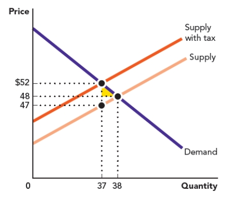
Use the figure Area of a Triangle II. The triangle in the accompanying graph represents the welfare loss to consumers who no longer participate in a market after a tax is placed on a good. Calculate the area of the triangle.
Figure: Area of a Triangle II
Free
(Short Answer)
4.8/5  (37)
(37)
Correct Answer: Verified
 ($52 - $48) x ($38 - $37) = $2
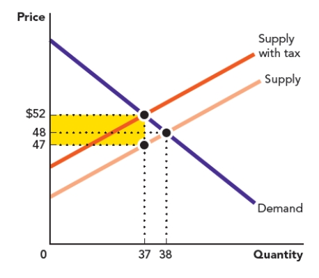
Use Figure: Area of a Triangle I The rectangle in the accompanying graph represents the tax revenue that is gained when a tariff is placed on a good. Calculate the area of the rectangle.
Figure: Area of a Rectangle I
Free
(Short Answer)
4.7/5 (29)
Correct Answer:Verified
($52 - $47) x ($37) = $185
Jose has a chart showing the relationship between income and life expectancy in 100 countries. Each country has its own data point, but there is no line connecting the data points. What kind of graph does Jose have?
Free
(Multiple Choice)
4.9/5 (34)
Correct Answer:Verified
C
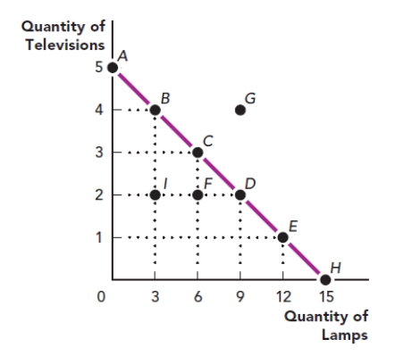
Use the figure The Production Possibilities Frontier I. What is the x-variable in this graph?
Figure: The Production Possibilities Frontier I
(Multiple Choice)
4.7/5 (37)
A scatter diagram shows a falling pattern of points in a graph representing the relationship between education and the probability of having a chronic illness. What can be concluded based on that pattern?
(Multiple Choice)
4.7/5 (40)
The price of a good is the y-variable and the quantity of a good that people want to buy is the x-variable. When the price of a hamburger increases from $10 to $12, the quantity of hamburger that people want to buy in a day decreases from 20 to 16. What is the slope of the line that describes the relationship between price and the quantity of hamburgers that people want to buy?
(Multiple Choice)
4.9/5 (33)
An economist wants to visualize whether there is a relationship between two variables by observing all of the different data points. What kind of graph is the most appropriate for this purpose?
(Multiple Choice)
4.7/5 (45)
Eloise has data on the different categories of spending on supplies at her company. She wants to illustrate this using a graph that shows a larger value - all spending on supplies - broken up into the smaller pieces for each category. What kind of graph should Eloise use?
(Multiple Choice)
4.8/5 (33)
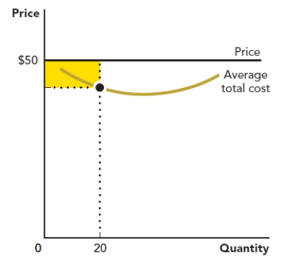
Use the figure Area of a Rectangle III. The rectangle in the accompanying graph represents the loss to a firm when it produces a quantity of 20 at a price of $500. Calculate the area of the rectangle.
Figure: Area of a Rectangle III
(Short Answer)
4.7/5 (35)
Use the figure The Production Possibilities Frontier III. What is the slope of the line between point H and point I?
Figure: The Production Possibilities Frontier III

(Multiple Choice)
4.8/5 (38)
Dorothy is interested in the relationship between how often she waters her plants and how many flowers they produce. What is true about the variable describing how often she waters her plants?
(Multiple Choice)
4.8/5 (32)
Use the figure Area of a Rectangle II. The rectangle in the accompanying graph represents the loss to a firm when it produces a quantity of 20 at a price of $10. Calculate the area of the rectangle.
Figure: Area of a Rectangle II
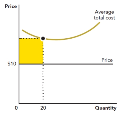
(Short Answer)
4.8/5 (40)
Use the figure A Firm's Profit. What is the correct method for calculating the area of the shape shaded in this graph?
Figure: A Firm's Profit

(Multiple Choice)
4.9/5 (38)
Use the figure The Production Possibilities Frontier III. What is the slope of the line between point I and point K?
Figure: The Production Possibilities Frontier III
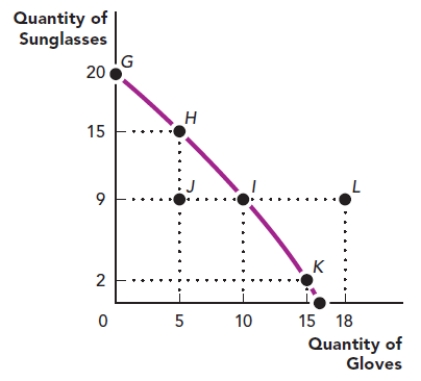
(Multiple Choice)
4.9/5 (44)
Use the figure A Firm's Profit. What is the area of the shape shaded in this graph?
Figure: A Firm's Profit
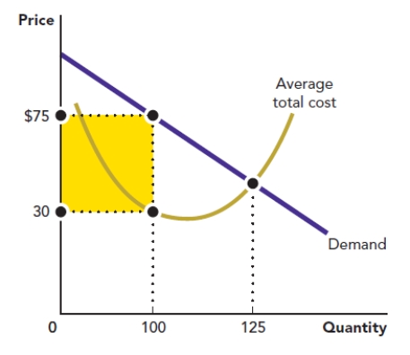
(Multiple Choice)
4.8/5 (31)
The rate at which a line rises or falls from left to right is its:
(Multiple Choice)
4.9/5 (24)
Filters
- Essay(0)
- Multiple Choice(0)
- Short Answer(0)
- True False(0)
- Matching(0)