Exam 2: The Organization and Graphic Presentation of Data
Exam 1: The What and the Why of Statistics50 Questions
Exam 2: The Organization and Graphic Presentation of Data64 Questions
Exam 3: Measures of Central Tendency50 Questions
Exam 4: Measures of Variability50 Questions
Exam 5: The Normal Distribution50 Questions
Exam 6: Sampling and Sampling Distributions50 Questions
Exam 7: Estimation50 Questions
Exam 8: Testing Hypotheses50 Questions
Exam 9: Bivariate Tables50 Questions
Exam 10: The Chi-Square Test and Measures of Association50 Questions
Exam 11: Analysis of Variance50 Questions
Exam 12: Regression and Correlation50 Questions
Select questions type
In a ______,the bars which represent the categories of a variable are spaced so that one bar is not directly next to another;whereas in a ______,the bars actually touch one another.
Free
(Multiple Choice)
4.8/5  (37)
(37)
Correct Answer: Verified
A
Considering the information in the table below,what would happen to the percentage of respondents age 20 if we simply dropped all respondents who were first married at age 21 from the sample?

Free
(Short Answer)
4.8/5 (37)
Correct Answer:Verified
The percentage would increase
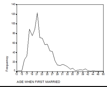
Presented below is a chart and a portion of the data for 550 respondents which were used to construct it.What is another type of graph that you can use to display this information? Construct this graph using the data below with the frequencies placed along the vertical axis.


Free
(Short Answer)
4.8/5 (38)
Correct Answer:Verified
Bar graph.
Inspecting the title and checking the sources are basic principles of
(Multiple Choice)
4.8/5 (29)
Imagine one of your colleagues is constructing a pie chart to graph results of the survey question "Which state do you live in?" What should be your first response upon reviewing their work?
(Multiple Choice)
4.8/5 (31)
Using the following information from the U.S.Census Bureau,how many military reserve personnel are white,black,or Latino?
 The total number of military reserve personnel is 129,047.
(Short Answer)
4.9/5 (30)
A rate based on the total population is referred to as a(n)______ rate.
(Multiple Choice)
4.9/5 (41)
Consider the information in the table below.Construct a pie chart for blacks in the sample.

(Essay)
4.8/5 (40)
According to this table,what percentage of respondents strongly agree or strongly disagree?

(Short Answer)
4.8/5 (34)
A graph showing the differences in frequencies or percentages among the categories of a nominal or an ordinal variable where the "pieces" add up to 100% of the total frequencies is referred to as a
(Multiple Choice)
4.8/5 (37)
A graph showing the differences in the frequencies or percentages among the categories of an interval-ratio variable where points are used to represent the frequencies of each category and placed above the midpoint of the category and then joined by a straight line is referred to as a
(Multiple Choice)
4.8/5 (32)
Imagine one of your colleagues is constructing a pie-chart to graph results of data collected on respondent's occupational prestige score,a score which can take on any non-zero value.What should be your first response upon reviewing the work?
(Multiple Choice)
4.9/5 (26)
A table showing the frequency at or below each category for a variable of interest is referred to as a
(Multiple Choice)
4.9/5 (32)
Construct a cumulative frequency distribution using the following information.Begin with whites and work through the table in the order of the racial categories listed.
 The total number of military reserve personnel is 129,047.
(Essay)
4.8/5 (34)
According to this table,what proportion of respondents neither agree nor disagree?

(Short Answer)
4.9/5 (31)
What other type of graph could be used to display the information in the chart below?
(Short Answer)
4.8/5 (39)
Would a bar chart or a histogram be more appropriate for displaying the data presented in the table below? Why?

(Essay)
4.9/5 (34)
Filters
- Essay(0)
- Multiple Choice(0)
- Short Answer(0)
- True False(0)
- Matching(0)