Exam 4: Effective Charts
Exam 1: Navigate, manipulate, and Print Worksheets106 Questions
Exam 2: Formatting, functions, and Formulas100 Questions
Exam 3: Cell References, named Ranges, and Functions102 Questions
Exam 4: Effective Charts98 Questions
Exam 5: Complex Conditional and Retrieval Functions100 Questions
Exam 6: Analyze Data Using Tables100 Questions
Exam 7: Multiple Worksheets workbooks and Templates100 Questions
Exam 8: Refine an Excel Application100 Questions
Exam 9: Organize, import, export, and Cleanse Data Sets100 Questions
Exam 10: Data Tables, scenario Manager, and Solver101 Questions
Exam 11: Loan Amortization, investment Analysis, and Asset Depreciation100 Questions
Exam 12: Business Statistics and Regression Analysis103 Questions
Exam 13: Excels Data Model, Power-pivot, and Power View96 Questions
Exam 14: Visual Basic for Applications99 Questions
Exam 15: Appendix:efficient Interaction With a Touch Screen67 Questions
Exam 16: The Common Features of Microsoft Office81 Questions
Select questions type
A common use for ________ charts is for project management.
Free
(Short Answer)
4.9/5  (34)
(34)
Correct Answer: Verified
Gantt
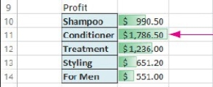 In the worksheet above,the red arrow is pointing at a(n)________
Free
(Short Answer)
4.8/5 (36)
Correct Answer:Verified
data bar
Gridlines can be customized by using the Format ________ Gridlines task pane.
Free
(Short Answer)
4.8/5 (44)
Correct Answer:Verified
Major
To illustrate the relationship of the parts to the whole,you would use a(n)________ chart.
(Multiple Choice)
4.9/5 (30)
Match the following terms to their definition.
Correct Answer:Verified
Premises:
Responses:
(Matching)
4.7/5 (32)
A bar chart is displayed horizontally and is useful for comparing categorized data sets.
(True/False)
4.8/5 (39)
Match the following terms to their definition.
Correct Answer:Verified
Premises:
Responses:
(Matching)
4.9/5 (37)
An enhanced pie chart is a chart in which a slice is pulled outward away from the other slices.
(True/False)
4.8/5 (22)
Match the following chart types to their application.
Correct Answer:Verified
Premises:
Responses:
(Matching)
4.7/5 (34)
When creating a chart from data in a worksheet,the legend data is indicated by ________.
(Multiple Choice)
4.7/5 (39)
The ________ tool is a contextual tool that provides single-click access to charts and PivotTables.
(Short Answer)
4.9/5 (40)
To see possible types of graph to use,you can click Recommended Charts in the ________.
(Multiple Choice)
4.8/5 (27)
You can display data bars as a one-color solid fill or a gradient fill from left to right as the numerical value increases.
(True/False)
4.8/5 (35)
To change the color of a chart ,you click Change Colors in the ________.
(Multiple Choice)
4.8/5 (35)
________ are small charts that are embedded into the cells in a worksheet to help with trend analysis.
(Multiple Choice)
4.7/5 (34)
Using a(n)________ pie chart,you can emphasize a slice by moving it out away from the other slices.
(Short Answer)
4.9/5 (32)
To move a chart,you double-click its border and drag the chart to a new location.
(True/False)
4.9/5 (33)
Match the following buttons to their action.


Correct Answer:Verified
Premises:
Responses:


(Matching)
4.7/5 (34)
Filters
- Essay(0)
- Multiple Choice(0)
- Short Answer(0)
- True False(0)
- Matching(0)