Exam 20: Graphs in Economics
Exam 1: First Principles233 Questions
Exam 2: Economic Models319 Questions
Exam 3: Supply and Demand292 Questions
Exam 5: International Trade 5274 Questions
Exam 6: Macroeconomics: the Big Picture168 Questions
Exam 7: Gdp and Cpi: Tracking the Macroeconomy434 Questions
Exam 8: Unemployment and Inflation354 Questions
Exam 9: Long-Run Economic Growth316 Questions
Exam 10: Savings, Investment Spending, and the Financial System402 Questions
Exam 13: Fiscal Policy Appendix Taxes and the Multiplier382 Questions
Exam 14: Money, Banking, and the Federal Reserve System468 Questions
Exam 15: Monetary Policy359 Questions
Exam 16: Inflation, Disinflation, and Deflation240 Questions
Exam 17: Crises and Consequences214 Questions
Exam 18: Events and Ideas322 Questions
Exam 19: Open-Economy Macroeconomics467 Questions
Exam 20: Graphs in Economics75 Questions
Exam 21: toward a Fuller Understanding of Present Value36 Questions
Select questions type
The slope of a straight line is the ratio of the:
Free
(Multiple Choice)
4.8/5  (35)
(35)
Correct Answer: Verified
A
Use the following to answer questions: 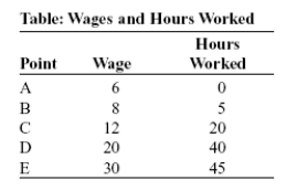 -(Table: Wages and Hours Worked) Look at the table Wages and Hours Worked. Graphing the relation with wages on the vertical axis and hours worked on the horizontal axis, the slope between point D and point E is:
Free
(Multiple Choice)
4.8/5 (36)
Correct Answer:Verified
D
Use the following to answer questions :
Figure: Hot Drinks Sold and Temperature 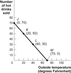 -(Figure: Hot Drinks Sold and Temperature) Look at the figure Hot Drinks Sold and Temperature. If we move from point J to point L in the figure, the outside temperature has ______ degrees and the number of hot drinks sold has ______.
Free
(Multiple Choice)
4.9/5 (32)
Correct Answer:Verified
D
Use the following to answer questions :
Figure: Slope 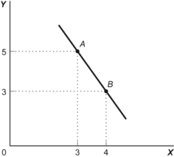 -(Figure: Slope) Look at the figure Slope. In the graph, the slope of the line between points A and B is:
(Multiple Choice)
4.9/5 (41)
In looking at a chart of the positive relationship between police officers and crime, the mayor remarks that more police officers cause more crime. The mayor may be wrong because she did not consider:
(Multiple Choice)
4.9/5 (37)
Two points on a nonlinear curve have coordinates given by (5, 15) and (17, 13). The average slope of the curve between these points is:
(Multiple Choice)
4.8/5 (39)
The ratio of the change in the variable on the vertical axis to the change in the variable on the horizontal axis, measured between two points on the curve, is the:
(Multiple Choice)
4.7/5 (32)
Taylor sees a bar graph showing the average weight of adult males over the past 200 years and concludes that men get more obese over time. Taylor's conclusion may be wrong, since she did not consider:
(Multiple Choice)
4.8/5 (33)
Use the following to answer questions :
Figure: Consumption of Pizza and Tacos 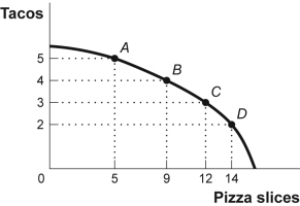 -(Figure: Consumption of Pizza and Tacos) Look at the figure Consumption of Pizza and Tacos. The figure shows the number of tacos and pizza slices Matt can eat in a day. The best estimate of the slope between point A and point B is -4.
(True/False)
4.8/5 (35)
Use the following to answer questions :
Figure: Good X and Good Y 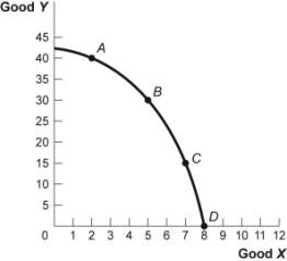 -(Figure: Good X and Good Y) Look at the figure Good X and Good Y. If we move from point B to point C in the figure, the x-variable has ______ units and the y-variable has ______ units.
(Multiple Choice)
4.8/5 (36)
The point at which the axes of a graph intersect is called the:
(Multiple Choice)
4.9/5 (35)
Use the following to answer questions : 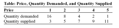 -(Table: Price, Quantity Demanded, and Quantity Supplied) Look at the table Price, Quantity Demanded, and Quantity Supplied. A straight line represents the relation between:
(Multiple Choice)
4.9/5 (36)
Use the following to answer questions:
Figure: Unemployment Rate over Time 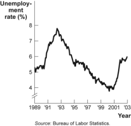 -(Figure: Unemployment Rate over Time) Look at the figure Unemployment Rate over Time. In the time-series graph, as we move from the beginning of 2001 to the beginning of 2003, we see that the unemployment rate has _____ from approximately _____ to approximately _____.
(Multiple Choice)
4.8/5 (35)
Use the following to answer question :
Figure: Y = f(X) 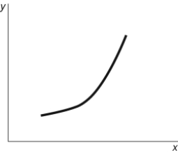 -(Figure: Y = f(X) Look at the figure Y = f(X). The slope of the relation between x and y:
(Multiple Choice)
4.8/5 (23)
An economist wishes to build a model to explain the relationship between the number of diamonds purchased every year and the average income of consumers in that year. Which variable should be the dependent variable and which should be the independent variable? All else equal, do you expect this relationship to be positive or negative? Explain.
(Essay)
4.9/5 (39)
Use the following to answer questions :
Figure: Demand and Supply 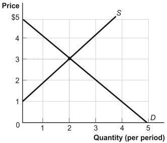 -(Figure: Demand and Supply) Look at the figure Demand and Supply. The curve labeled S indicates that a price of $2 is related to a quantity of:
(Multiple Choice)
4.9/5 (34)
Filters
- Essay(0)
- Multiple Choice(0)
- Short Answer(0)
- True False(0)
- Matching(0)