Exam 20: Graphs in Economics
Exam 1: First Principles233 Questions
Exam 2: Economic Models319 Questions
Exam 3: Supply and Demand292 Questions
Exam 5: International Trade 5274 Questions
Exam 6: Macroeconomics: the Big Picture168 Questions
Exam 7: Gdp and Cpi: Tracking the Macroeconomy434 Questions
Exam 8: Unemployment and Inflation354 Questions
Exam 9: Long-Run Economic Growth316 Questions
Exam 10: Savings, Investment Spending, and the Financial System402 Questions
Exam 13: Fiscal Policy Appendix Taxes and the Multiplier382 Questions
Exam 14: Money, Banking, and the Federal Reserve System468 Questions
Exam 15: Monetary Policy359 Questions
Exam 16: Inflation, Disinflation, and Deflation240 Questions
Exam 17: Crises and Consequences214 Questions
Exam 18: Events and Ideas322 Questions
Exam 19: Open-Economy Macroeconomics467 Questions
Exam 20: Graphs in Economics75 Questions
Exam 21: toward a Fuller Understanding of Present Value36 Questions
Select questions type
Use the following to answer questions :
Figure: Illustrating Slope 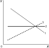 -(Figure: Illustrating Slope) Look at the figure Illustrating Slope. In the graph, line 1 depicts X and Y to be:
(Multiple Choice)
4.8/5  (29)
(29)
Use the following to answer question : 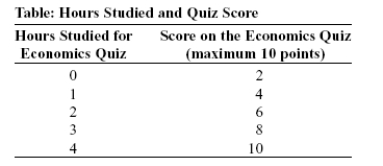 -(Table: Hours Studied and Quiz Score) Look at the table Hours Studied and Quiz Score. The table shows data for students in an economics class. If we were to graph these data and draw a line through the points, we would choose ______ to be the independent variable; the vertical intercept of our line would be ______; and the slope of our line would be ______.
(Multiple Choice)
4.7/5 (41)
Use the following to answer questions :
Figure: Demand and Supply 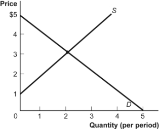 -(Figure: Demand and Supply) Look at the figure Demand and Supply. The slope of the curve labeled D is:
(Multiple Choice)
4.9/5 (41)
Use the following to answer questions :
Table: Wages and Hours Willing to Work 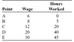 -(Table: Wages and Hours Willing to Work) Look at the table Wages and Hours Willing to Work. If it was graphed, the relationship between wage per hour and hours willing to work would be:
(Multiple Choice)
4.8/5 (39)
Use the following to answer questions :
Figure: Good X and Good Y 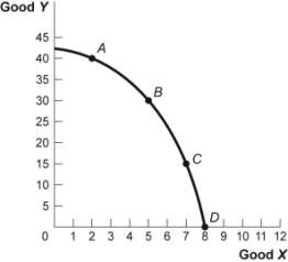 -(Figure: Good X and Good Y) Look at the figure Good X and Good Y. If we move from point C to point B in the figure, the x-variable has ______ units and the y-variable has ______ units.
(Multiple Choice)
4.8/5 (42)
The owner of the Dismal Philosopher, one of five bookstores on College Road, asks you to make a graph showing each College Road bookstore's share of all five stores' book purchases. The best way to show this information is with:
(Multiple Choice)
4.9/5 (29)
Use the following to answer questions :
Figure: Demand and Supply
-(Figure: Demand and Supply) Look at the figure Demand and Supply. The slope of the curve labeled S is:
(Multiple Choice)
4.8/5 (44)
Use the following to answer questions :
Figure: Consumption of Pizza and Tacos 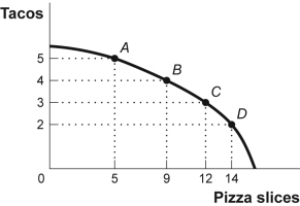 -(Figure: Consumption of Pizza and Tacos) Look at the figure Consumption of Pizza and Tacos. The figure shows the number of tacos and pizza slices Matt can eat in a day. The relation is nonlinear, and there is a negative relation between the number of tacos and pizza slices that Matt can eat in a day.
(True/False)
4.8/5 (33)
Use the following to answer questions :
Figure: Demand and Supply 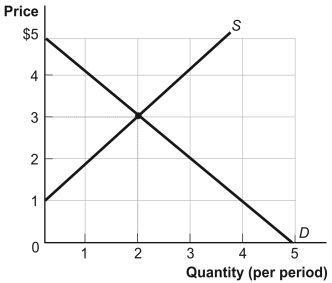 -(Figure: Demand and Supply) Look at the figure Demand and Supply. The curve labeled D indicates that a price of $2 is related to a quantity of:
(Multiple Choice)
4.8/5 (39)
Use the following to answer questions:
Figure: Unemployment Rate over Time 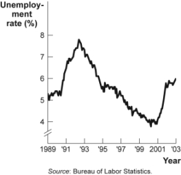 -(Figure: Unemployment Rate over Time) Look at the figure Unemployment Rate over Time. In the time-series graph, as we move from 1991 to 1993, we see that the unemployment rate has _____ from approximately _____ to approximately _____.
(Multiple Choice)
4.8/5 (30)
Use the following to answer questions :
Figure: Labor Force Participation Rate 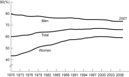 -(Figure: Labor Force Participation Rate) Look at the figure Labor Force Participation Rate. Using the figure, the labor force participation rate for women was ______ during 1970-1985 and ______ during 1998-2006.
(Multiple Choice)
4.8/5 (24)
The fact that two variables always move together over time:
(Multiple Choice)
4.8/5 (42)
If two variables are negatively related, they will always be represented by:
(Multiple Choice)
4.8/5 (39)
Use the following to answer questions :
Figure: Seasonally Adjusted Unemployment Rate 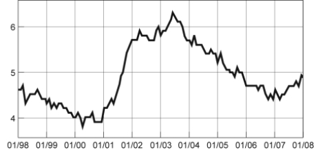 -(Figure: Seasonally Adjusted Unemployment Rate) Look at the figure Seasonally Adjusted Unemployment Rate. The distance between each labeled point on the horizontal axis is one year. Unemployment was ______ between 1/2001 and 1/2002 and ______ between 1/1999 and 1/2000.
(Multiple Choice)
4.8/5 (30)
Use the following to answer questions :
Figure: Cold Drinks Sold and Temperature 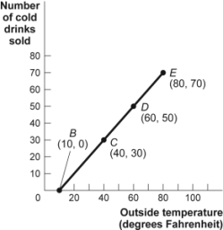 -(Figure: Cold Drinks Sold and Temperature) Look at the figure Cold Drinks Sold and Temperature. If we move from point C to point D in the figure, the outside temperature has ______ degrees and the number of cold drinks sold has ______.
(Multiple Choice)
4.8/5 (43)
Use the following to answer questions:
Figure: Unemployment Rate over Time
-(Figure: Unemployment Rate over Time) Look at the figure Unemployment Rate over Time. In the time-series graph, as we move from 1993 to 1995, we see that the unemployment rate has _____ from approximately _____ to approximately _____.
(Multiple Choice)
5.0/5 (26)
Use the following to answer questions :
Figure: Cold Drinks Sold and Temperature
-(Figure: Cold Drinks Sold and Temperature) Look at the figure Cold Drinks Sold and Temperature. If we move from point C to point E in the figure, the outside temperature has ______ degrees and the number of cold drinks sold has ______.
(Multiple Choice)
4.8/5 (34)
Use the following to answer questions :
Figure: Hot Drinks Sold and Temperature 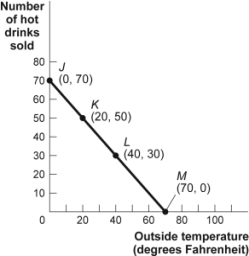 -(Figure: Hot Drinks Sold and Temperature) Look at the figure Hot Drinks Sold and Temperature. If we move from point K to point L in the figure, the outside temperature has ______ degrees and the number of hot drinks sold has ______.
(Multiple Choice)
4.9/5 (36)
Use the following to answer questions:
Figure: Unemployment Rate over Time
-(Figure: Unemployment Rate over Time) Look at the figure Unemployment Rate over Time. In the time-series graph, as we move from 1997 to 2001, we see that the unemployment rate has _____ from approximately _____ to approximately _____.
(Multiple Choice)
4.9/5 (39)
Filters
- Essay(0)
- Multiple Choice(0)
- Short Answer(0)
- True False(0)
- Matching(0)