Exam 19: Graphs in Economics
Exam 1: First Principles198 Questions
Exam 2: Economic Models: Trade-Offs and Trade296 Questions
Exam 3: Supply and Demand264 Questions
Exam 4: Price Controls and Quotas: Meddling With Markets200 Questions
Exam 5: International Trade258 Questions
Exam 6: Macroeconomics: the Big Picture153 Questions
Exam 7: Gdp and the Cpi: Tracking the Macroeconomy321 Questions
Exam 8: Unemployment and Inflation332 Questions
Exam 9: Long-Run Economic Growth298 Questions
Exam 10: Savings, Investment Spending, and the Financial System385 Questions
Exam 11: Income and Expenditure130 Questions
Exam 12: Aggregate Demand and Aggregate Supply345 Questions
Exam 13: Fiscal Policy346 Questions
Exam 14: Money, Banking, and the Federal Reserve System428 Questions
Exam 15: Monetary Policy340 Questions
Exam 16: Inflation, Disinflation, and Deflation221 Questions
Exam 17: Macroeconomics: Events and Ideas309 Questions
Exam 18: International Macroeconomics441 Questions
Exam 19: Graphs in Economics60 Questions
Select questions type
Use the following to answer questions: 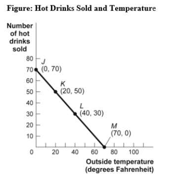 -(Figure: Hot Drinks Sold and Temperature)Use Figure: Hot Drinks Sold and Temperature.If we move from point K to point L in the figure,the outside temperature has _____ degrees and the number of hot drinks sold has _____.
(Multiple Choice)
4.9/5  (33)
(33)
Use the following to answer questions: 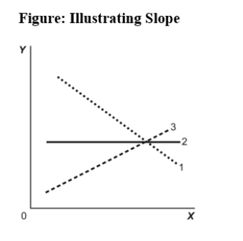 -(Figure: Illustrating Slope)Use Figure: Illustrating Slope.In the graph,line 3 depicts X and Y to be:
(Multiple Choice)
4.8/5 (36)
Use the following to answer question 19: 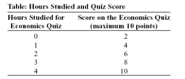 -(Table: Hours Studied and Quiz Score)Use Table: Hours Studied and Quiz Score.The table shows data for students in an economics class.If we were to graph these data and draw a line through the points,we would choose _____ to be the independent variable;the vertical intercept of our line would be _____;and the slope of our line would be _____.
(Multiple Choice)
4.8/5 (32)
Use the following to answer questions: 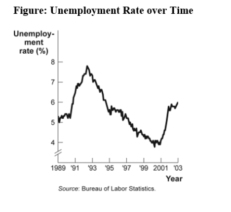 -(Figure: Unemployment Rate over Time)Look at the figure Unemployment Rate over Time.In the time-series graph,as we move from the beginning of 2001 to the beginning of 2003,we see that the unemployment rate has _____ from approximately _____ to approximately _____.
(Multiple Choice)
4.8/5 (30)
Use the following to answer questions: 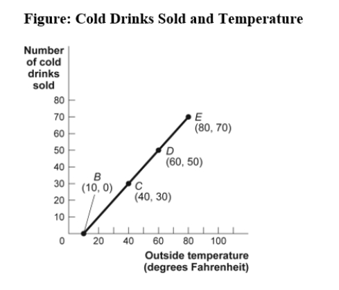 -(Figure: Cold Drinks Sold and Temperature)Use Figure: Cold Drinks Sold and Temperature.If we move from point C to point E in the figure,the outside temperature has _____ degrees and the number of cold drinks sold has _____.
(Multiple Choice)
4.9/5 (30)
Use the following to answer questions: 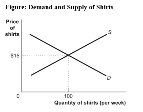 -(Figure: Demand and Supply of Shirts)Use Figure: Demand and Supply of Shirts.In the graph,if the line labeled D shows how many shirts per week will be demanded at various prices,then it is clear that,as the price of shirts falls:
(Multiple Choice)
4.8/5 (30)
If two variables are negatively related,they will always be represented by a:
(Multiple Choice)
4.8/5 (38)
Use the following to answer questions: 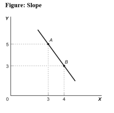 -The ratio of the change in the variable on the vertical axis to the change in the variable on the horizontal axis,measured between two points on the curve,is the:
(Multiple Choice)
4.8/5 (38)
Use the following to answer questions:
-(Figure: Unemployment Rate over Time)Use Figure: Unemployment Rate over Time.In the time-series graph,as we move from 1993 to 1995,we see that the unemployment rate has _____ from approximately _____% to approximately _____%.
(Multiple Choice)
5.0/5 (40)
Use the following to answer questions:  -In the graph of a curve,the vertical intercept is the:
(Multiple Choice)
4.8/5 (39)
Use the following to answer questions: 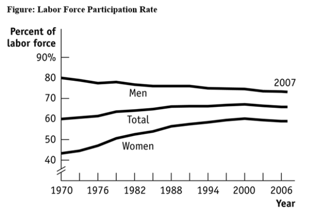 -(Figure: Labour Force Participation Rate)Use Figure: Labour Force Participation Rate.During 1970-1985,the labour force participation rate was _____ for women and _____ for men.
(Multiple Choice)
4.7/5 (31)
Use the following to answer questions:
-(Figure: Unemployment Rate over Time)Use Figure: Unemployment Rate over Time.In the time-series graph,as we move from 1997 to 2001,we see that the unemployment rate has _____ from approximately _____% to approximately _____%.
(Multiple Choice)
4.9/5 (33)
Your boss asks you to graph company profits for the past 10 years.The BEST way to show this information is with a(n):
(Multiple Choice)
4.7/5 (39)
Professor Macro wants to use a numerical graph to show the percentage of government spending accounted for by its various components.Which graph is MOST suitable for this purpose?
(Multiple Choice)
4.9/5 (43)
A _____ graph shows how the value of one or more variables has changed over some period.
(Multiple Choice)
4.8/5 (28)
In a time-series graph,large changes can be made to appear insignificant by:
(Multiple Choice)
4.8/5 (38)
The _____ of a curve shows the point at which the curve intersects an axis.
(Multiple Choice)
4.8/5 (38)
Filters
- Essay(0)
- Multiple Choice(0)
- Short Answer(0)
- True False(0)
- Matching(0)