Exam 19: Graphs in Economics
Exam 1: First Principles198 Questions
Exam 2: Economic Models: Trade-Offs and Trade296 Questions
Exam 3: Supply and Demand264 Questions
Exam 4: Price Controls and Quotas: Meddling With Markets200 Questions
Exam 5: International Trade258 Questions
Exam 6: Macroeconomics: the Big Picture153 Questions
Exam 7: Gdp and the Cpi: Tracking the Macroeconomy321 Questions
Exam 8: Unemployment and Inflation332 Questions
Exam 9: Long-Run Economic Growth298 Questions
Exam 10: Savings, Investment Spending, and the Financial System385 Questions
Exam 11: Income and Expenditure130 Questions
Exam 12: Aggregate Demand and Aggregate Supply345 Questions
Exam 13: Fiscal Policy346 Questions
Exam 14: Money, Banking, and the Federal Reserve System428 Questions
Exam 15: Monetary Policy340 Questions
Exam 16: Inflation, Disinflation, and Deflation221 Questions
Exam 17: Macroeconomics: Events and Ideas309 Questions
Exam 18: International Macroeconomics441 Questions
Exam 19: Graphs in Economics60 Questions
Select questions type
Use the following to answer questions: 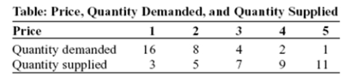 -(Table: Price,Quantity Demanded,and Quantity Supplied)Use Table: Price,Quantity Demanded,and Quantity Supplied.The data in the figure suggest a non-linear relation between:
(Multiple Choice)
4.8/5  (34)
(34)
The owner of the Dismal Philosopher,one of the five bookstores on University Road,asks you to make a graph showing each College Road bookstore's share of all five stores' book purchases.The BEST way to show this information is with a(n):
(Multiple Choice)
4.9/5 (50)
Use the following to answer questions: 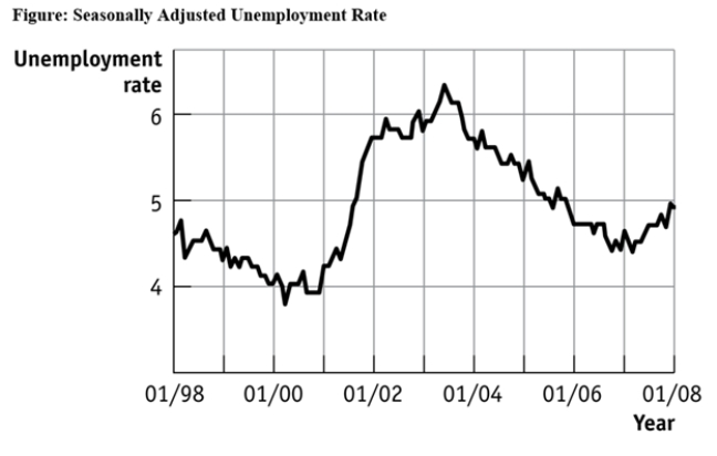 -(Figure: Seasonally Adjusted Unemployment Rate)Use Figure: Seasonally Adjusted Unemployment Rate.The distance between each labeled point on the horizontal axis is 1 year,and the distance between each labeled point on the vertical axis is 1 percentage point of unemployment.Unemployment was _____ between 1/2001 and 1/2002 and _____ between 1/1999 and 1/2000.
(Multiple Choice)
4.9/5 (41)
The relation between two variables that move in the same direction is said to be:
(Multiple Choice)
4.9/5 (41)
Use the following to answer questions: 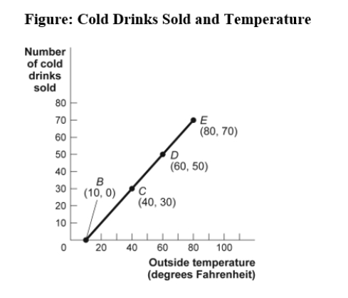 -(Figure: Cold Drinks Sold and Temperature)Use Figure: Cold Drinks Sold and Temperature.If we move from point C to point D in the figure,the outside temperature has _____ degrees and the number of cold drinks sold has _____.
(Multiple Choice)
4.8/5 (30)
Use the following to answer questions:
-(Figure: Seasonally Adjusted Unemployment Rate)Use Figure: Seasonally Adjusted Unemployment Rate.The distance between each labeled point on the horizontal axis is 1 year,and the distance between each labeled point on the vertical axis is 1 percentage point of unemployment.Using this graph,the unemployment rate was at its lowest point (in the time window shown)in _____ and at its highest point (in the time window shown)in _____.
(Multiple Choice)
4.7/5 (41)
The point at which the axes of a graph intersect is called the:
(Multiple Choice)
4.8/5 (33)
The fact that two variables always move together over time:
(Multiple Choice)
4.9/5 (38)
Use the following to answer questions: 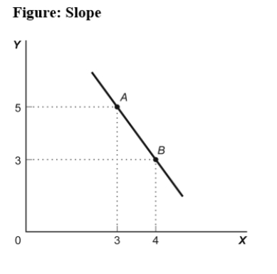 -(Figure: Slope)Use Figure: Slope.In the graph,the slope of the line between points A and B is:
(Multiple Choice)
4.9/5 (32)
Use the following to answer questions: 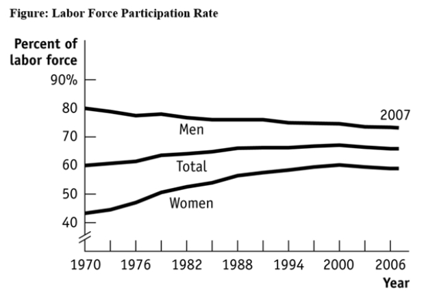 -(Figure: Labour Force Participation Rate)Use Figure: Labour Force Participation Rate.Using the figure,the labour force participation rate for women was _____ during 1970-1985 and _____ during 1998-2006.
(Multiple Choice)
4.8/5 (34)
Use the following to answer question 22: 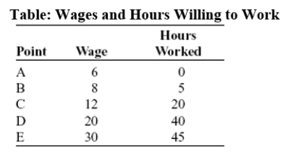 -(Table: Wages and Hours Willing to Work)Use Table: Wages and Hours Willing to Work.If it was graphed,the relationship between wage per hour and hours willing to work would be:
(Multiple Choice)
4.9/5 (43)
Use the following to answer questions: 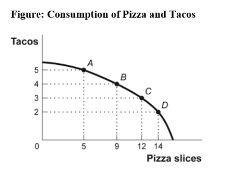 -(Figure: Consumption of Pizza and Tacos)Use Figure: Consumption of Pizza and Tacos.The figure shows the number of tacos and pizza slices Matt can eat in a day.The relation is non-linear,and there is a negative relation between the number of tacos and pizza slices that Matt can eat in a day.
(True/False)
4.9/5 (31)
Use the following to answer questions:
-(Figure: Consumption of Pizza and Tacos)Use Figure: Consumption of Pizza and Tacos.The figure shows the number of tacos and pizza slices Matt can eat in a day.The best estimate of the slope between point A and point B is -4.
(True/False)
4.8/5 (42)
The owner of the Dismal Philosopher,one of the five bookstores on University Road,asks you to make a graph showing each University Road bookstore's share of all five stores' book purchases.A good way to show this information is with a pie chart.
(True/False)
5.0/5 (34)
Use the following to answer questions: 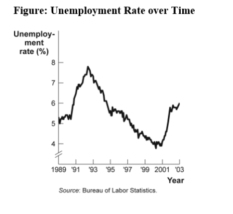 -(Figure: Unemployment Rate over Time)Use Figure: Unemployment Rate over Time.In the time-series graph,as we move from 1991 to 1993,we see that the unemployment rate has _____ from approximately _____% to approximately _____%.
(Multiple Choice)
4.8/5 (38)
The relation between two variables that move in opposite directions is said to be:
(Multiple Choice)
4.9/5 (35)
Use the following to answer questions: 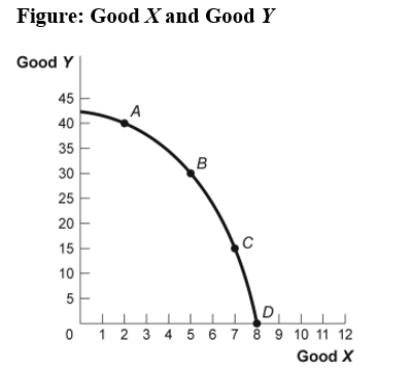 -(Figure: Good X and Good Y)Use Figure: Good X and Good Y.If we move from point C to point B in the figure,the x-variable has _____ units and the y-variable has _____ units.
(Multiple Choice)
4.8/5 (43)
Use the following to answer questions:
-(Figure: Seasonally Adjusted Unemployment Rate)Use Figure: Seasonally Adjusted Unemployment Rate.The distance between each labeled point on the horizontal axis is 1 year,and the distance between each labeled point on the vertical axis is 1 percentage point of unemployment.What is the approximate slope of the graph between 1/2001 and 1/2003 (using percentage point and years as the units on the vertical and horizontal axes,respectively)?
(Multiple Choice)
4.9/5 (35)
Filters
- Essay(0)
- Multiple Choice(0)
- Short Answer(0)
- True False(0)
- Matching(0)