Multiple Choice
The figure given below represents the effects in the labor markets due to migration. Here the world has been divided into a high-income "North" (left panel) and a low-income "South" (right panel) . Dn and Sn are the labor demand and the labor supply curves in North. Ds and (Sr + Smig) are the labor demand and pre-migration labor supply curves in South. Sr is the post-migration labor supply curve in South. The value c is the cost of migrating. 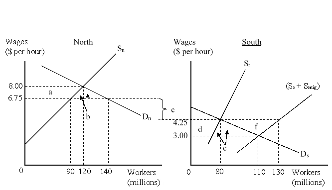 When migration between North and South is allowed, how many workers will choose to migrate to North?
A) 20 million
B) 30 million
C) 40 million
D) 50 million
Correct Answer:

Verified
Correct Answer:
Verified
Q39: The figure given below represents the effects
Q40: In the past three decades many developing
Q41: Which of the following groups are positively
Q42: Foreign Direct Investment (FDI) refers to:<br>A)the flow
Q43: The figure given below represents the effects
Q45: Foreign Direct Investment is used for all
Q46: It is easier to transfer capital from
Q47: Which of the following provides a good
Q48: Which of the following refers to transfer
Q49: The figure given below represents the effects