Multiple Choice
The following pie chart presents the percentages of fish caught in each of four ratings categories.
Match this pie chart with its corresponding bar graph.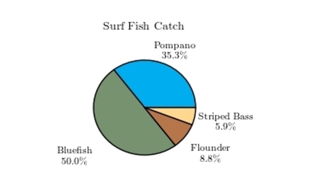
A) 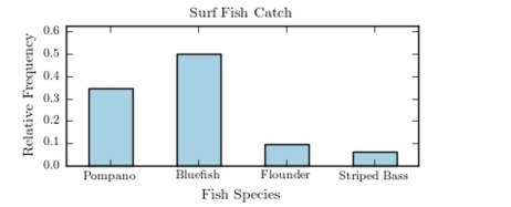
B) 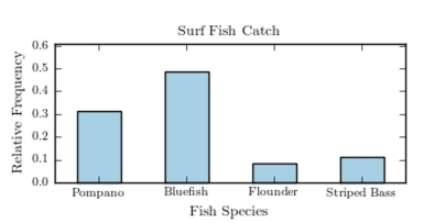
C) 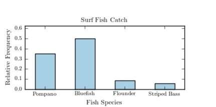
D) 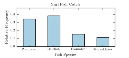
Correct Answer:

Verified
Correct Answer:
Verified
Related Questions
Q20: Thirty households were surveyed for the
Q21: Construct a dotplot for the following
Q22: Thirty households were surveyed for the
Q23: The following frequency distribution presents the
Q24: The following table presents the purchase
Q26: The following frequency distribution presents the
Q27: The following frequency distribution presents the
Q28: Which of the following presents the most
Q29: The following table presents the purchase
Q30: A sample of 200 high school students