Multiple Choice
Construct a pie chart representing the given data set.
-The data below represent the results of a poll in which the following question was asked: "To what degree are you
Satisfied with your current health insurance?"
Very
Somewhat
Not at All
No opinion 
A) 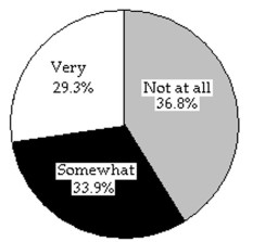
B) 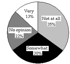
Correct Answer:

Verified
Correct Answer:
Verified
Q42: A nurse measured the blood pressure of
Q43: A parcel delivery service lowered its prices
Q44: The stacked line chart shows the value
Q45: A nurse measured the blood pressure of
Q46: Construct a frequency table for the
Q48: Answer the question using the graphical display.
Q49: A nurse measured the blood pressure of
Q50: Provide the appropriate response.<br>-The following dot plot
Q51: A car insurance company conducted a
Q66: Explain the difference between a frequency distribution