Essay
Answer the question.
-The graph below shows the approximate annual percentage growth rate in world
population for the years 1960 through 2010. Data is estimated by the UN Census Bureau. 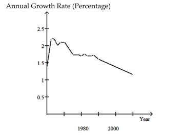 Why must the graph be interpreted with care? If the graph is not interpreted with care
what misleading impression might one have of world population during the period
1960-2010? In which year during the period 1960-2010 is estimated world population the
greatest? During which years did world population increase at the fastest rate?
Summarize the overall trends in world population during the period 1960-2010.
Correct Answer:

Verified
The graph must be interpreted with care ...View Answer
Unlock this answer now
Get Access to more Verified Answers free of charge
Correct Answer:
Verified
View Answer
Unlock this answer now
Get Access to more Verified Answers free of charge
Q18: Describe how you would apply the five
Q19: Identify which of these types of sampling
Q20: Solve the problem.<br>-For the study described below,
Q21: The graph below shows estimated world
Q22: Use the guidelines to evaluate the study.
Q24: In order to answer the given question,
Q25: Use the guidelines to evaluate the study.
Q26: Answer the question.<br>-What name is given to
Q27: The graph below shows the approximate annual
Q28: Make a bar graph to represent