Multiple Choice
The following pie chart presents the percentages of fish caught in each of four ratings cate
Match this pie chart with its corresponding Parato chart.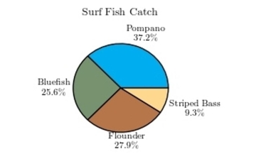
A) 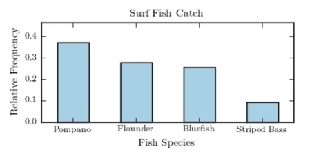
B) 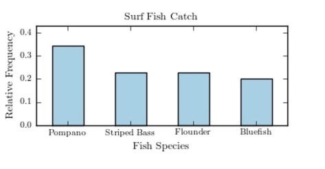
gories.
C) 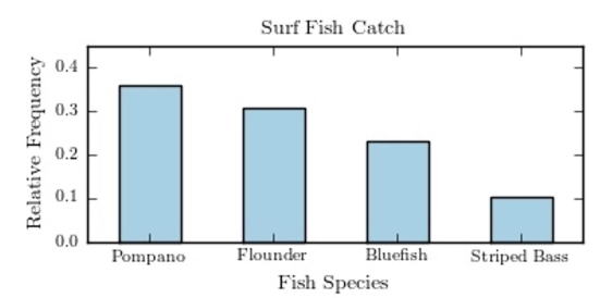
D) 
Correct Answer:

Verified
Correct Answer:
Verified
Related Questions
Q4: Thirty households were surveyed for the
Q5: The following bar graph presents the average
Q6: If the limits for a class were
Q7: Which of the following pairs of class
Q8: The following frequency distribution presents the
Q10: <span class="ql-formula" data-value="\begin{array}{l}\text { Construct a pie
Q11: The following frequency distribution presents the
Q12: The following frequency distribution presents the
Q13: A histogram is a graph that represents
Q14: For grouped frequency distributions, the is obtained