Multiple Choice
Which choice displays the best graphic display of the amount of nitrous oxide (NO) explained by the amount of carbon monoxide (CO) emissions in million metric tons over a ten year period in the United States? The data set
Is below:
A) Nitrous Oxide (NO) and Carbon Monoxide (CO) Emissions in the U.S. over Ten Years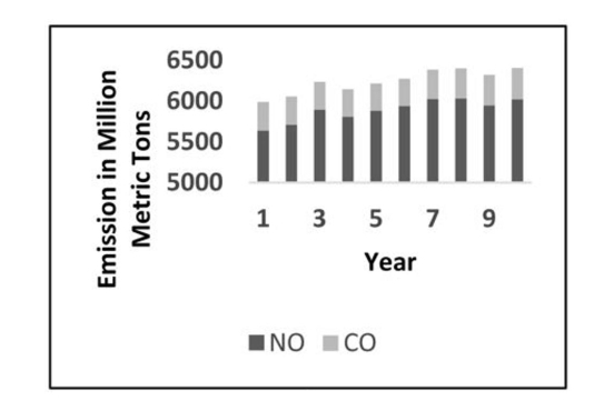
B) Nitrous Oxide (NO) and Carbon Monoxide (CO) Emissions in the U.S. over Ten Years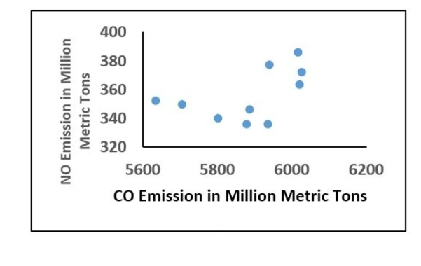
C) Nitrous Oxide (NO) and Carbon Monoxide (CO) Emissions in the U.S. over Ten Years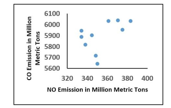
D) Nitrous Oxide (NO) and Carbon Monoxide (CO) Emissions in the U.S. over Ten Years
Correct Answer:

Verified
Correct Answer:
Verified
Q4: Describe the differences between a histogram and
Q73: The frequency distribution below summarizes employee
Q74: Construct a pie chart representing the
Q75: The attendance counts for this season's
Q76: The histogram below represents the number of
Q77: Use the data to create a
Q79: The data shows the roundtrip mileage
Q80: Solve the problem.<br>-At the National Criminologists
Q81: A store manager counts the number
Q83: Attendance records at a school show