Essay
Construct a pie chart representing the given data set.
-The graph below shows the number of car accidents occurring in one city in each of the years 2001 through
2006. The number of accidents dropped in 2003 after a new speed limit was imposed. Does the graph distort the
data? How would you redesign the graph to be less misleading? 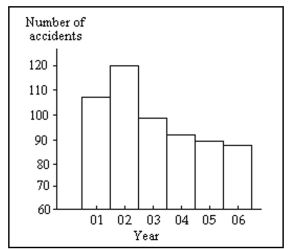
Correct Answer:

Verified
The graph distorts the data because the ...View Answer
Unlock this answer now
Get Access to more Verified Answers free of charge
Correct Answer:
Verified
View Answer
Unlock this answer now
Get Access to more Verified Answers free of charge
Q15: Solve the problem.<br>-Suppose that you construct a
Q19: The histogram below represents the number of
Q20: <span class="ql-formula" data-value="\begin{array}{c|c}\text { Speed } &
Q21: The frequency distribution below summarizes the
Q22: A nurse measured the blood pressure of
Q23: The frequency distribution below summarizes the
Q25: In a survey, 20 people were
Q26: The frequency distribution below summarizes the
Q27: In a survey, 26 voters were
Q28: A medical research team studied the