Essay
Construct a pie chart representing the given data set.
-The graph below shows the average cost of renting a studio in one city in each of the years 2002 through 2006.
By what percentage does the average price increase from 2002 to 2003? Obtain a second version of the graph by
sliding a piece of paper over the bottom of the graph so that the bars start at 300. In this new graph, by what
percentage does the price appear to increase from 2002 to 2003? Is the second graph misleading? 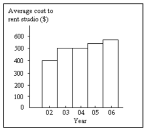
Correct Answer:

Verified
The average price increases by 25% from ...View Answer
Unlock this answer now
Get Access to more Verified Answers free of charge
Correct Answer:
Verified
View Answer
Unlock this answer now
Get Access to more Verified Answers free of charge
Q38: Solve the problem.<br>-Construct a frequency distribution and
Q122: Use the high closing values of
Q123: The frequency table below shows the
Q124: Construct a pie chart representing the
Q125: Use the data to create a
Q126: Identify the cumulative frequency distribution that
Q127: The following data represent the number
Q130: Construct one table that includes relative frequencies
Q131: The two key parts of a regression
Q132: A nurse measured the blood pressure of