Multiple Choice
The population in a certain city has been increasing at a decreasing rate. Which graph best represents this?
A) 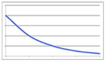
B) 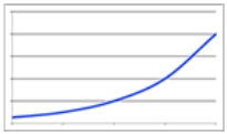
C) 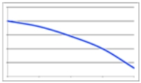
D) 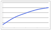
Correct Answer:

Verified
Correct Answer:
Verified
Related Questions
Q8: The following table shows the average price
Q9: The following bar graph shows the annual
Q10: When we adjust a graph for inflation,
Q11: The following table from the World Health
Q12: The following table shows average prices per
Q14: The following table from the World Health
Q15: The following table shows the number of
Q16: Percentage _ in a function is the
Q17: This bar graph shows the percentage of
Q18: The following table shows the average starting